YEAR
2025
PROJECT
FELLSKY
CATEGORY
UX CONSULTING
PROJECT DURATION
40 HRS
MY CONTRIBUTION
I delivered strategic UX & Design Consulting for FellSky — an early-stage AI startup — B2B AI Platform, bringing clarity, speed and direction. I helped validate their ideas, structure their product's journey, and facilitating their processes. I set the pace of the product evolution by implementing UX best practices, introducing AI tools that accelerated prototyping and discovery, and ensuring our design outputs were feasible and developer-ready. Thanks to this approach, the project gained traction and clarity — helping the team secure a R$100,000 investment to keep growing the platform and attracting more clients.
Strategy & Direction
90%
Product Discovery
80%
Information Architecture
80%
Wireframing & IA Input
94%
UX Design
85%
Design Facilitation
95%
THE GOAL
Define the direction of their B2B platform through strategic UX guidance and lean design practices. The ultimate objective was to build a usable and developer-friendly product experience that could attract more clients, investments and move fast without breaking.
In a context where time and resources were incredibly limited, I leaned heavily on AI to move fast and smart. From UX research to wireframing, content writing, prototyping, and documentation, tools like ChatGPT, Claude, Gemini, and others became essential design allies. My expertise wasn’t just in designing — it was in knowing how to extract the best from each AI tool to amplify my impact. This became one of the most valuable learning experiences of my career, proving that when used wisely, AI can help designers deliver smarter, faster, and better.


THE CHALLENGE
The team was composed of only two developers and had almost no budget. The startup had ambitious ideas, but lacked clarity, structure, and UX expertise to move forward. They needed someone to bring momentum and direction — without relying on big design teams, expensive tools, or over-engineered prototypes. I had to lead the product rhythm, introduce effective UX practices, leverage AI tools for faster discovery and prototyping, and ensure everything delivered was realistic for development.
THE RESULTS
After just 40 hours of consulting spread over two intense months of collaboration, FellSky launched their MVP 2.0 — fully equipped with a powerful dashboard, intelligent forms, AI-based sentiment analysis, and an automated monitoring system. This new version unlocked what the founders couldn’t achieve alone: traction, clarity, and most importantly — real funding.
TAGS
AI Software
B2B
SaaS
UX Consulting
FellSky
THE TEAM
DEV. TEAM
2
DESIGNERS
1
PRODUCT OWNERS
1
QA
0
01
/
05
Turning a messy draft into a key client-closing asset.
WHAT IS FELLSKY
FellSky is an early-stage AI SaaS startup that transforms how companies listen, understand, and act on their conversations. By combining automatic transcription, AI insights, and customizable QA workflows, FellSky helps businesses unlock hidden value from thousands of audio interactions — without expanding their teams.
The platform empowers teams to create dynamic processes that adapt to their operational reality, enabling efficient and accurate analysis of voice interactions at scale, where data aren't just numbers, but insights. FellSky is built to serve highly regulated and high-volume industries, such as:
Contact Centers.
Monitor 100% of calls, standardize scripts, and spot bottlenecks early.
Banks & Insurers
Ensure compliance and cut risks with real-time automatic alerts.
Collections & Credit
Detect objections, churn signals, and opportunities at the right time.
Sales & Support
Boost CSAT and resolution time with clear operator feedback.
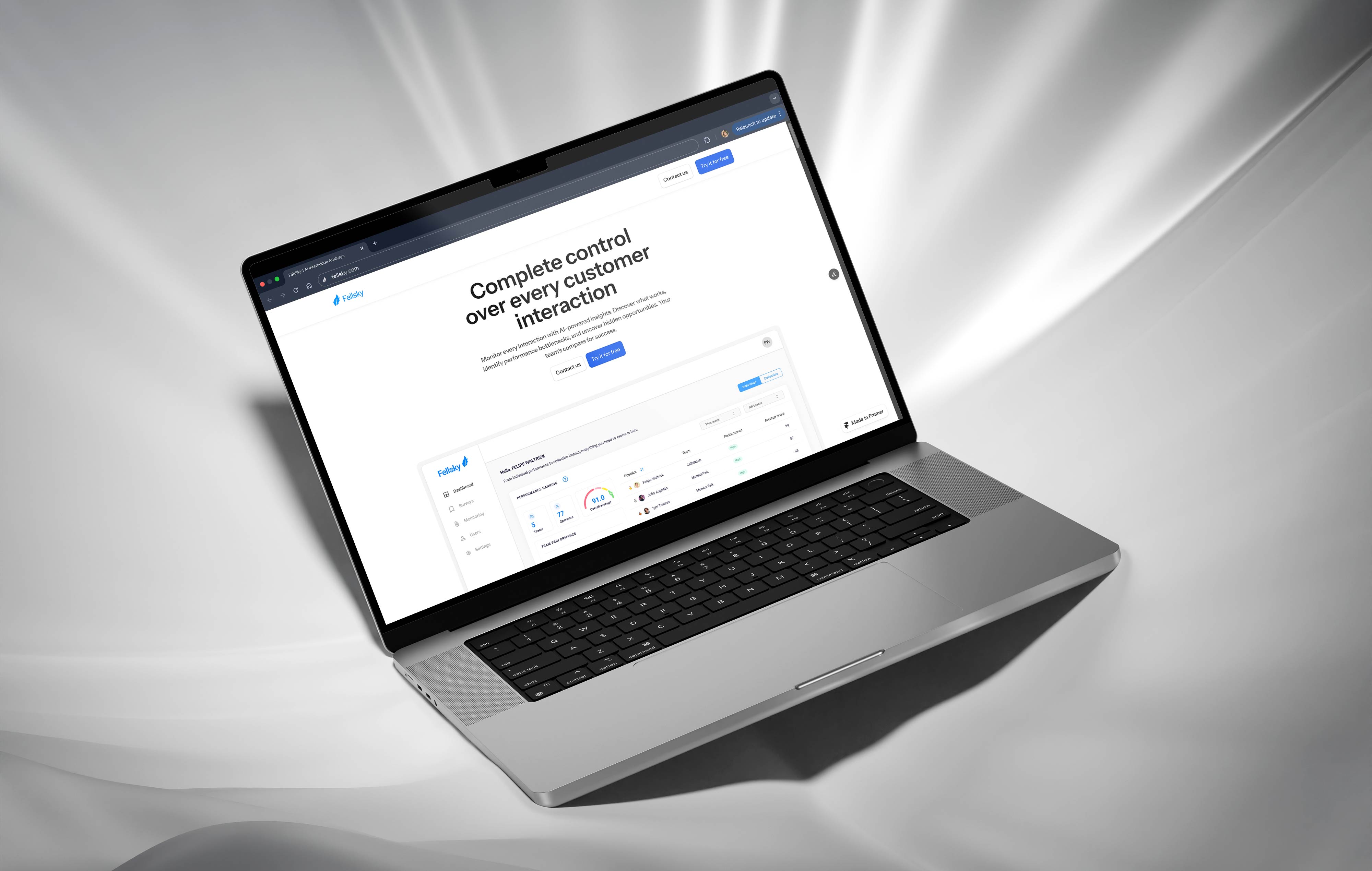
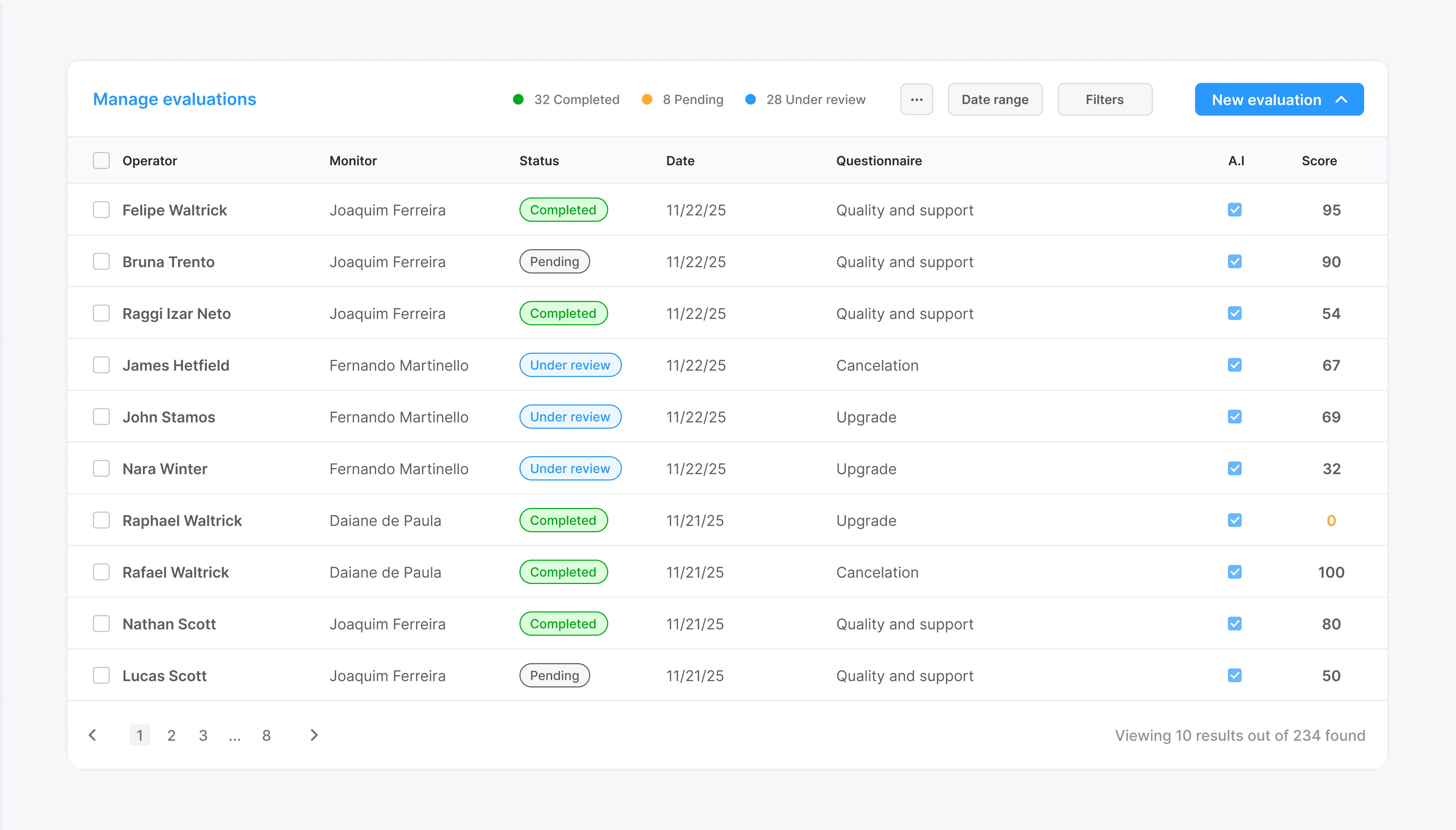
BUILDING A DASHBOARD
FellSky’s founders had an urgent need: they were pitching their product to a potential client who made one thing clear — no dashboard, no deal. They had some rough sketches, but lacked clarity in structure, visual hierarchy, and product logic.
STRATEGIC DESIGN & REQUIREMENTS GATHERING
As a design strategist and facilitator, I led a process to challenge assumptions, extract business logic and bring speed and structure to the design. But most importantly, I translated vague ideas into formalized documentation, as recommended by software good practices.
Funcional and non-functional requirements.
This was a turning point for the dashboard that helped us turn a messy idea into a key client-closing asset. And to be ever more assertive, AI was very helpful in this stage.
SIMPLIFYING COMPLEXITY
Designing this dashboard was a complex challenge — not just visually, but logically. The system needed to turn AI-evaluated questionnaires into performance metrics across multiple dimensions: teams, operators, questionnaires, and even subgroups within questionnaires. Users had to combine filters like date ranges, multi-select lists, and hierarchical groupings — all while making sense of detailed performance scoring, daily averages, and rankings. My role was to deeply analyze these hidden relationships and transform a dense operational system into something clean, legible, and actionable. Every interaction was designed to simplify complexity — so that teams could trust the insights without needing to understand the mechanics underneath.

img: their Initial wireframe sketch
With the documentation ready, I wireframed some ideas and once approved, I jumped straight into a high-fidelity prototype in Figma — and delivered the first interactive version. João, a great salesperson, used the prototype itself as the centerpiece of the pitch. The client loved it and signed the deal.
Dashboard designed


02
/
05
Designing a smarter way to ask questions
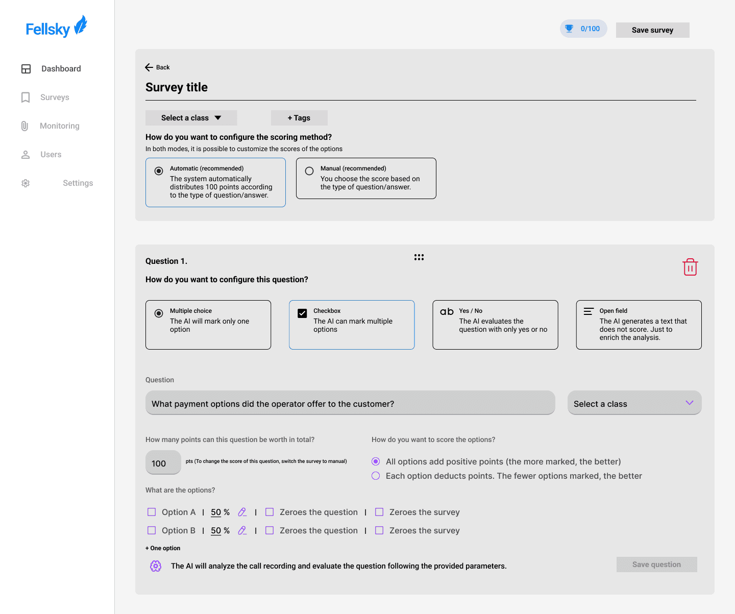
BUILDING A QUESTIONNAIRES SYSTEM
The questionnaire is a fundamental part of their system. It’s responsible for collecting key data used to generate AI-powered evaluations of each teams and operators. These responses also feed directly into the dashboard, allowing coordinators to visualize strengths, weaknesses, and trends. Without the questionnaire, there would be no data to process, analyze, or act on.
FellSky’s original questionnaire system was extremely limited. The entire feature was built around binary “Yes/No” questions, with no flexibility for different question types, scoring logic, or rich insights. Creating and managing questionnaires was clunky, unintuitive, and offered no onboarding or context for how the system worked — especially considering that these questionnaires would later be answered by an AI model.

img: fellsky's previous binary yes/no questions
UNDERSTANDING THE NEEDS — AND THE GAPS
From the beginning, I noticed that there was no guidance for users on how questionnaires were structured or how the AI would use them. The experience was uninviting and required too much prior knowledge. So I redesigned the entire workflow from scratch — starting with better onboarding, contextual tooltips, and UI patterns inspired by platforms like Google Forms and Microsoft Forms.
MORE PERSONALIZATION
To make questionnaires more versatile and insightful, I suggested multiple new question types
Multiple choice
Single option, where AI selects only one answer.
Checkbox
Multiple options, where AI selects multiple answers.
Yes / No
Binary validation with scoring logic.
Open-ended text
AI generates a non-scoring answer for context.
CONFIGURATION, SCORING AND FLEXIBILITY
I added smart configuration tools to improve usability and control:
🔄
Drag and drop
Question ordering
🗑️
Duplicate and delete
Easier forms personalization
📊
Scoring system options
Automatic or manual
These additions allowed the product to cover far more real-world monitoring scenarios while keeping the logic simple enough for teams to use without friction.

img: fellsky's questionnaires screen
WIREFRAMES AND STUDIES

03
/
05
Transforming call recordings into actionable insights
CALL EVALUATIONS
At the core of FellSky’s platform lies the concept of a call evaluation — an AI-powered evaluation of recorded calls between an operator and a client. The system transcribes the audio into text and, based on business logic and AI models, generates structured data to measure performance, tone, behavior, and overall quality of the interaction. The initial version of this feature was minimal. It allowed users to upload an audio file, select the operator and client, optionally choose a questionnaire, and then receive a basic score.
Even with the new customizable questionnaire formats I had introduced, the monitoring system lacked depth. It treated complex human conversations as a binary scoring mechanism. That’s when we decided to elevate the product into something far more intelligent — something that could generate real business insights from conversations, even without a questionnaire.
EMOTIONS AREN'T JUST WORDS, THEY'RE SIGNALS
Emotions can’t be reduced to simple words. Human sentiment is layered — it comes through in tone, timing, repetition, silence, even contradictions. Mapping these subtleties into something the system could process, interpret, and turn into insight was a massive UX and product challenge.
Confidence
Happiness
Anxiety
Insatisfaction
Patience
Excitement
Calmness
Hurry
Doubts
Insecurity
Anger
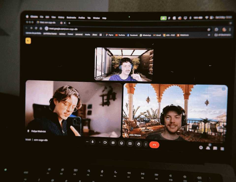
GROUNDING EMOTION MAPPING IN SCIENCE
To avoid guessing or oversimplifying human behavior, I took a research-based approach to designing the emotional logic behind the system. I consulted with a licensed psychologist and studied methods from neuroscience, behavioral psychology, and neurolinguistics to better understand how emotion is expressed in conversations — beyond just word choice.
This exploration helped us define emotion clusters and behavioral indicators that aligned with real cognitive and social patterns. By grounding this part of the product in scientific methodology, we were able to design an experience that felt more human — and generate insights that were more trustworthy.
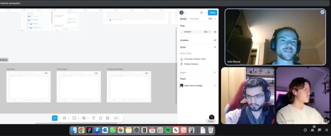
img: google meet video chat with João and Gabriel Gago, psychologist.
FROM WORDS TO DATA
My role was to help define how emotions, tone, politeness, tension, and behavioral patterns could be converted into structured, useful information. I wasn't just trying to measure positive or negative sentiment. I wanted to answer more difficult — and valuable — questions, like:
Studying behavioral analysis models.
Consulting a licensed psychologist to understand how to classify and interpret emotional cues.
Mapping customer and operator dynamics in realistic support environments.
To reach that level of intelligence, I helped lead a deep research process that included:
Why has this team’s revenue dropped compared to last quarter?
What behavior patterns are emerging in our lowest-performing operators?
Are customers consistently frustrated with a specific process?
The goal was to avoid meaningless metrics (e.g., “20% of calls were positive”) and instead produce insights that actually influence operational decisions.
THREE-LAYER MONITORING UX
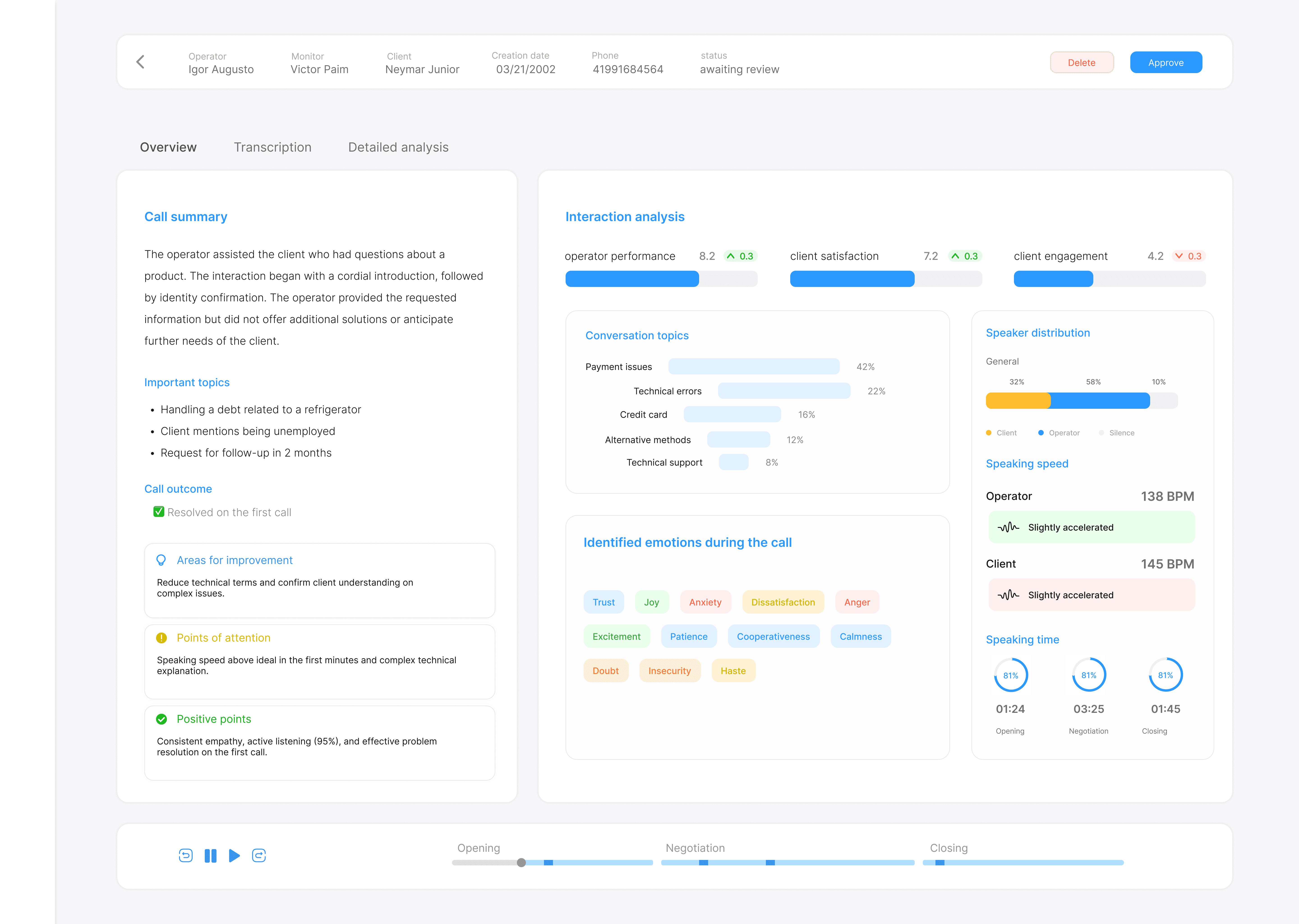
I designed the monitoring view in three tabs, each with a specific purpose and level of depth.
OVERVIEW TAB
Audio player fixed at the top
Summary of the call (topics discussed, resolution type)
Interaction analysis: operator performance, customer satisfaction, and engagement
Topic segmentation with time percentages (e.g., Payment issues 42%, Tech errors 22%)
Sentiment distribution by speaker (operator vs. client)
Talk time balance between both parties
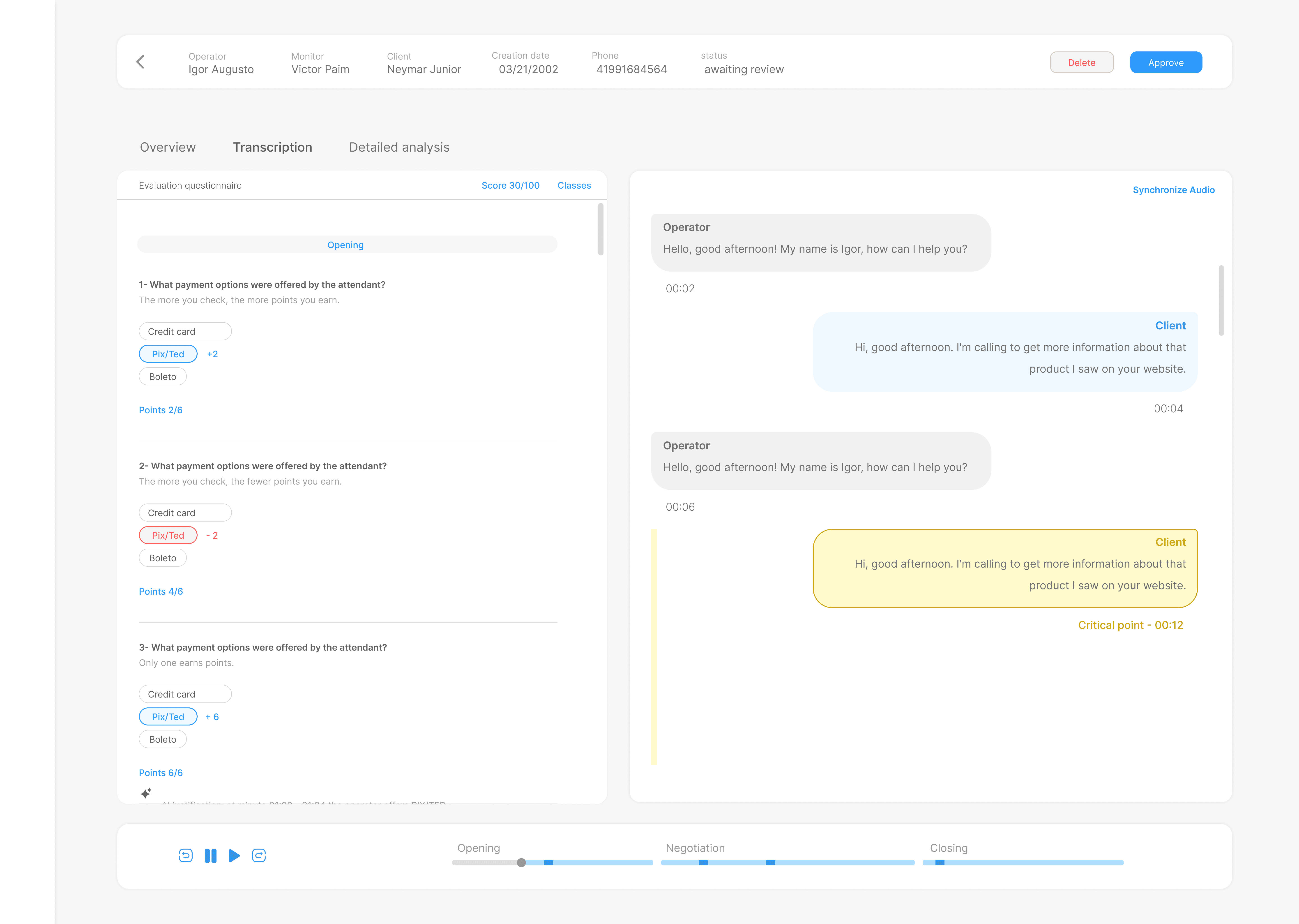
TRANSCRIPT TAB
Synchronized transcript + audio playback
Questionnaire on the left (if applicable)
Dialogue transcript in chat format
Smart markers triggered by AI alerts (e.g., “Rude tone detected”)
Embedded insights explaining what the AI flagged and why
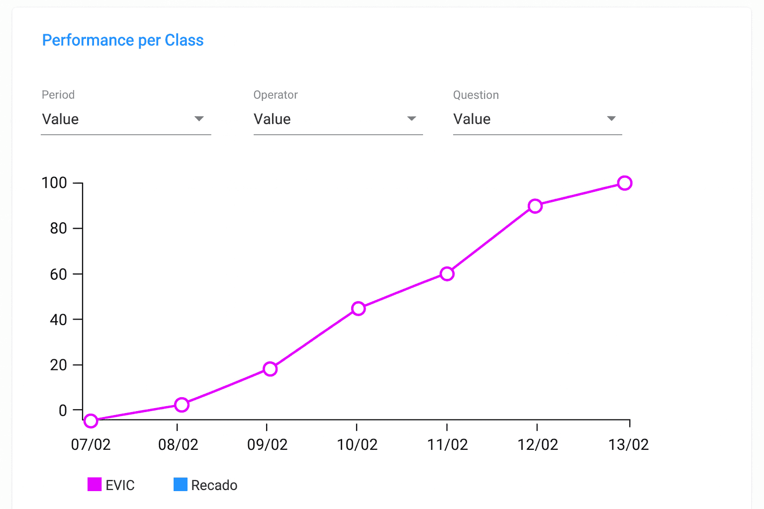
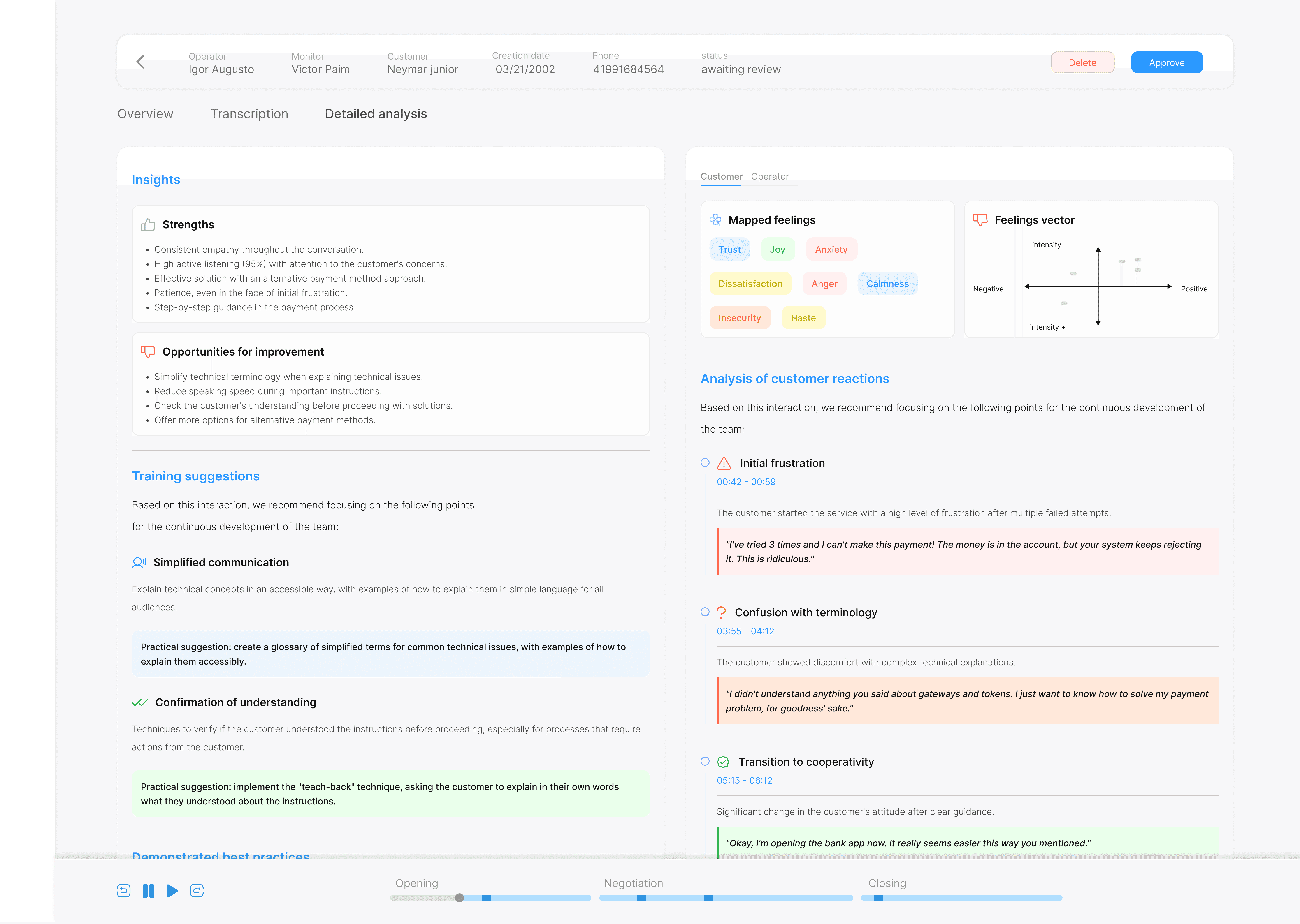
DETAILED ANALYSIS TAB
Strengths & weaknesses extracted from the call
AI-generated coaching suggestions
Emotion graphs (line + spider chart view)
Customer reaction analysis: transcript snippets + AI interpretation and actionable recommendations
UX DESIGN WITH HIGH CONSTRAINTS
Designing this feature required more than clean UI. I had to:
Align natural language processing output with clear UX patterns.
Balance human complexity with data legibility.
Guide product and dev teams through functional and non-functional requirement docs.
Think modularly — each insight needed to work on its own, but also tell a complete story when viewed together.
With no time for deep testing and only two devs, I helped reduce scope without sacrificing the core value of the feature. Every visual, term, and interaction was designed to make emotional insights tangible and useful.
WHAT COMES NEXT: ASK TO AI
To build on this foundation, I also helped outline a future-facing feature called ask to AI — allowing managers to type natural language prompts, like:

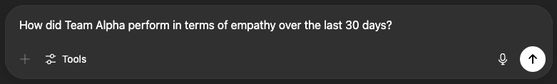
img: ask to ai, fellsky's future feature.
This turns FellSky from an analysis tool into a conversation intelligence platform, where data isn't just shown — it answers questions.
UX GALLERY


04
/
05
API Integrations
SEAMLESS INTEGRATIONS THAT UNLOCKED AUTOMATION
Manual work was killing FellSky’s scalability. Until this point, generating a single AI-powered Call Evaluation required a long sequence of manual tasks. Managers needed to download audio files from external dialer systems (VOIP), manually register each operator inside FellSky, create one evaluation at a time, and match audio with operators and questionnaires — a process that could take minutes per call.
Now imagine doing that 500 times a day.
If the process wasn’t scalable, we wouldn’t get adoption.
MAKING FELLSKY TALK TO THE OUTSIDE WORLD
Call centers don’t operate in a vacuum — they rely on external dialers that already store critical data: operator names, client IDs, timestamps, call durations, and audio recordings. Yet, none of this data was flowing into FellSky. Every evaluation had to be created from scratch — a barrier to any team doing this at scale.
I worked closely with the founders to design and spec a native integration system, starting with VOIP providers — the backbone of most call centers. The idea was simple: automatically pull metadata and audio from VOIP calls and make them available inside FellSky, ready to be used in evaluations.
INTEGRATION HIGHLIGHTS
I worked closely with the developers to make sure that the API could work with our system, leading integration from the ground up, defining the UX flows, error handling, and even how the API handshake would be presented — enabling seamless automation while preserving clarity and control for the user.
My UX deliverables included
A modular integrations hub to support future external systems (starting with CallFlex).
A clean OAuth-based authorization flow that communicated permission boundaries.
A smart data mapping strategy to sync IDs across platforms (operators, teams, clients).
Feedback and loading states to ensure users felt safe and informed throughout the process.

img: integration UI with CallFlex
WHY THIS MATTERED FOR FELLSKY
This wasn’t just a “nice-to-have” integration — it was the core enabler for everything that came next: automatic evaluations, batch processing, operational scale. By integrating with VOIP providers, FellSky could now ingest real-time call data and automatically trigger evaluations — no manual upload, no metadata matching, no delays.
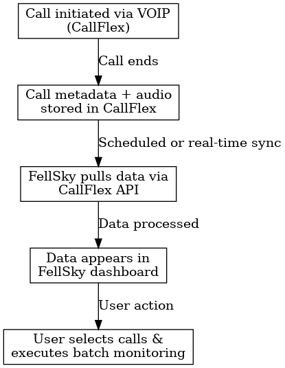
img: diagram illustrating the CallFlex
STRATEGIC OUTCOMES
Slashed setup time from minutes to seconds per evaluation.
Made the product viable for large teams (500+ calls/day).
Laid the groundwork for future integrations with CRM and ticketing tools.
Shifted FellSky from a standalone tool to a fully embedded part of the contact center workflow.
05
/
05
Smarter workflows for multiple calls reviews
FROM ONE-BY-ONE TO ONE-TO-MANY
As integration matured, it unlocked a new challenge: scale. While VOIP integration made customer calls available in real time, evaluating hundreds of them still required manual effort. That’s where I designed the final piece of the system — batch evaluations, a way to trigger multiple automated assessments with a single setup.
Scaling evaluations with a simple user experience
Previously, even with automation support, creating evaluations required uploading one audio file at a time, assigning the operator manually, selecting a questionnaire, and triggering the analysis. For call centers handling 500+ calls a day, this was simply not feasible.
My role here was to rethink the interaction model entirely, making bulk evaluations easy, safe, and flexible — while maintaining data consistency and user control.

img: before & after flow comparison of single vs batch evaluation setup
SMARTER FILTERS
I introduced a filter-first model where users begin by narrowing down the calls they want to evaluate. Since VOIP systems store thousands of call logs per week, this filtering layer was crucial for usability and performance.
Users can filter calls by:
Agent or team: operator, team name and cliente name.
Interaction data: call direction (inbound/outbound), call outcome, duration range, and a custom date range (up to 30 days back).
Once the filters are applied, a table dynamically loads only calls that haven't yet been evaluated - avoiding duplicates by design.
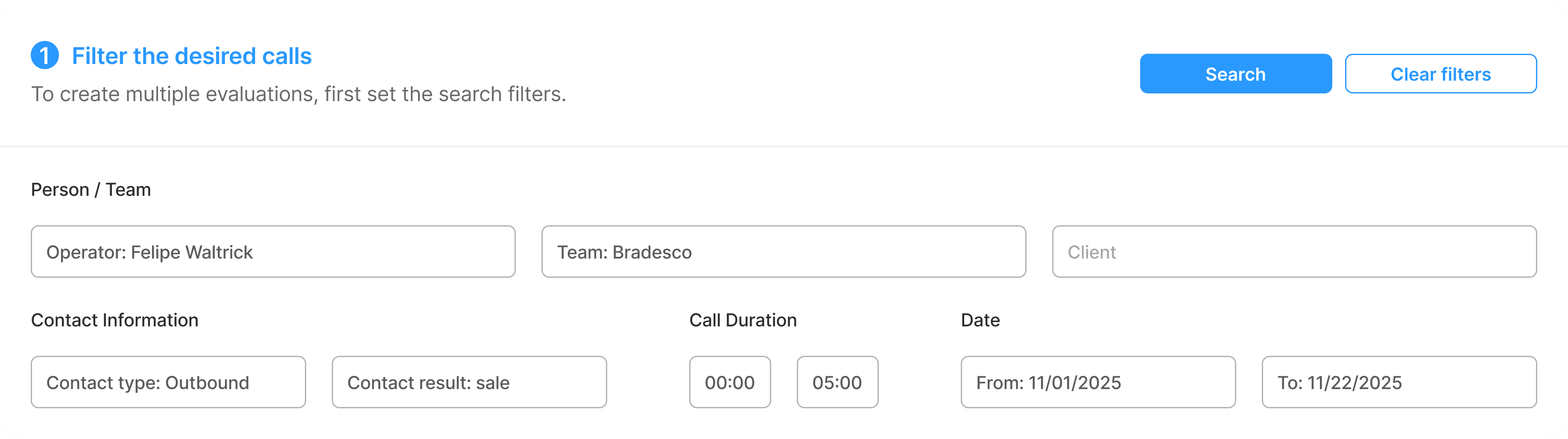
img: modal UI showing filters and search results table
DESIGNING FOR EFFICIENCY
Each row of the results table is pre-selected by default, with the ability to deselect or manually fine-tune. Columns include operator, team, client, duration, and timestamp. The interface is paginated (8 records per page) to avoid overwhelming the user or overloading the browser.
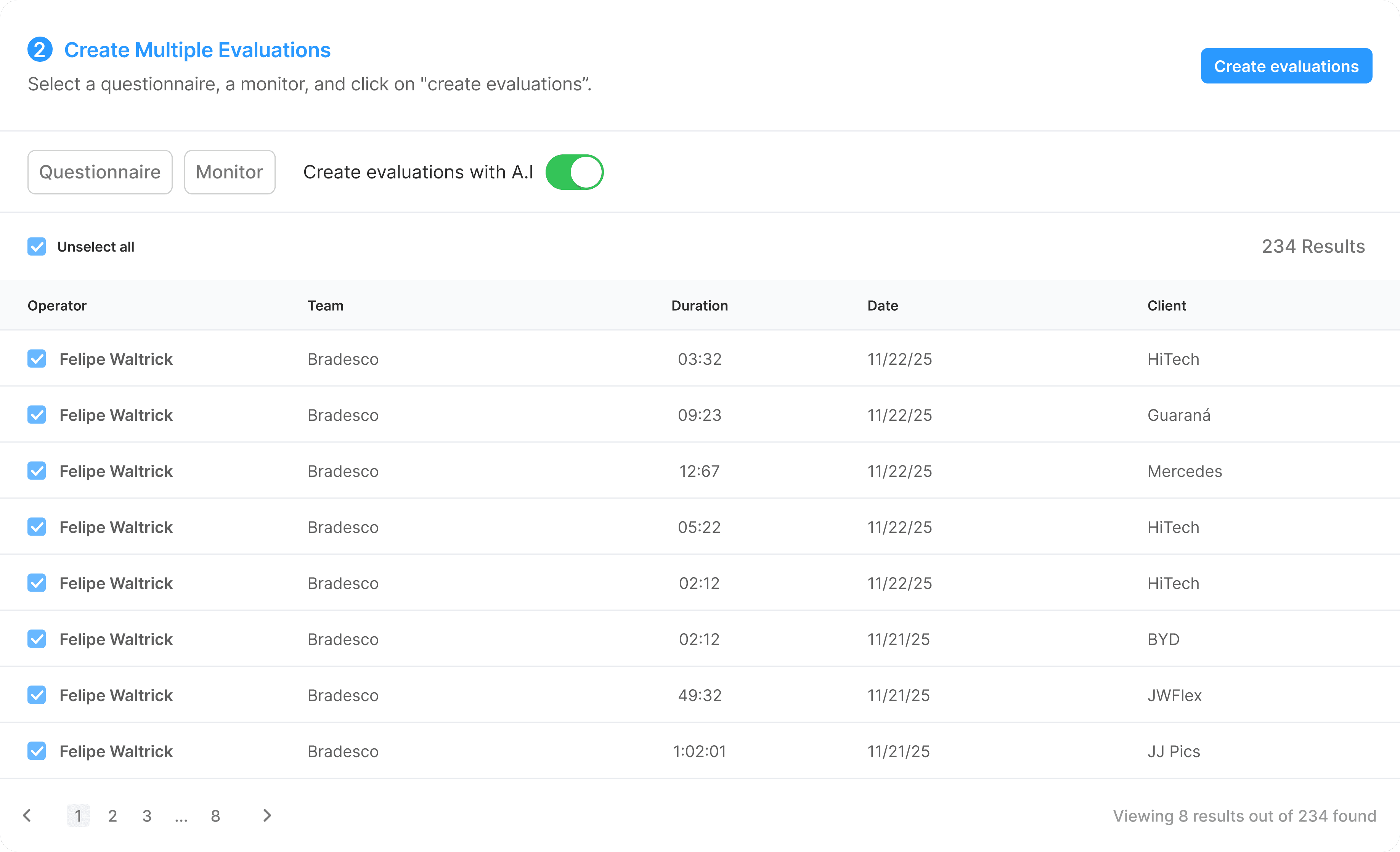
After selecting the desired rows, the user chooses a questionnaire and a reviewer, then creates the evaluations.
The system then begins batch processing. The evaluations appear instantly in the results table (if completed) or in a secondary section labeled "evaluations in progress", which updates as background processing completes.
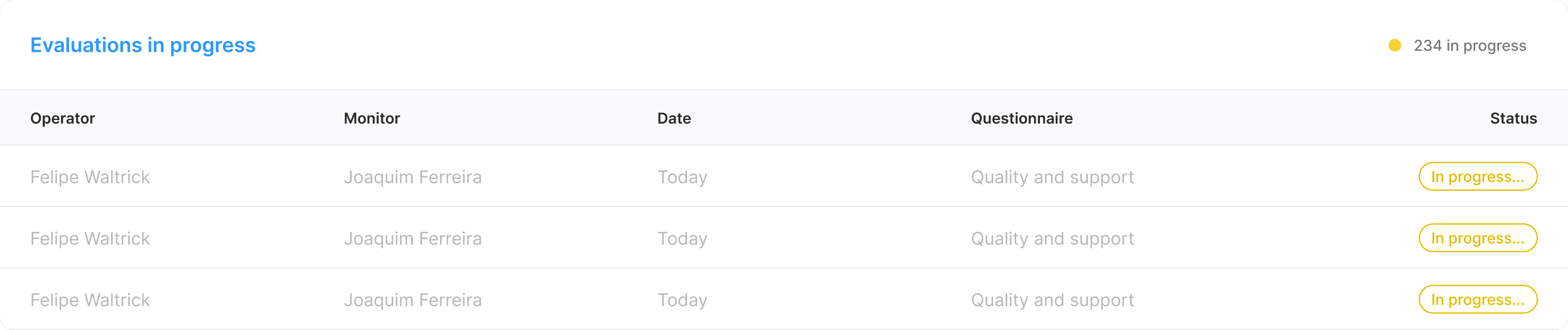
img: evaluation progress component with status indicators
UX IMPACT HIGHLIGHTS
Cut evaluation setup time by 90%.
Reduced error-prone manual steps.
Empowered managers to assess hundreds of calls in minutes, not hours.
Created a framework that can later be extended to trigger evaluations via API, allowing for true real-time performance monitoring.
To sum up
UX Consulting Results
A new investor injected R$ 100.000 into the company, enabling them to hire 3 new developers and double their current staff. With a stronger product and new resources, they went from 4 paying clients to 19, including deals in progress with a Mercedes dealership — a major leap for a team that was previously struggling to scale.


What went well
UX that unlocked real capital
My UX Consulting translated directly into business growth. The dashboard and features I designed helped secure funding and close deals.
Developer-ready deliverables
By turning vague ideas into functional and non-functional specs, I gave developers exactly what they needed — no guesswork, just execution.
Business-first Design Thinking
Instead of jumping into pixels, I led with questions, strategy, and structure. This approach helped uncover the real product gaps holding them back.
What I learned
Emotion can be engineered
Mapping human sentiment into structured data challenged me to research neuroscience, consult a psychologist, and create something both technical and empathetic.
Simplicity hides complexity
Behind every clean interface was a tangled web of filters, edge cases, and business logic. Designing for usability meant wrestling with complexity first.
Constraints fuel creativity
With no UX team, no researchers, and little time — I wore every hat. This forced me to make smart tradeoffs, prioritize, and lead confidently through ambiguity.