

An end-to-end redesign of bradesco_next’s cards experience, consolidating credit and debit journeys into a single, intuitive flow and validating key design decisions with real users.
The solution reached its final form after multiple research, testing, and refinement cycles, meeting all predefined success criteria before moving forward.
A new interaction model simplified how users browse and switch between cards.
The redesigned card sub-home proved intuitive, even for first-time users.
Key card actions became easier to discover, reducing navigation friction.
Visual hierarchy, copy, and interactions improved clarity and confidence.
The solution reached validation without critical usability issues.
Year
2025
Project
bradesco_next
Category
UX/UI
Project duration
6-8 months


From three apps and fragmented card patterns… to a single, unified, multi-card experience - designed for scale and accessibility

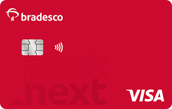
Bradesco App
Bradesco Cards

Next Banking

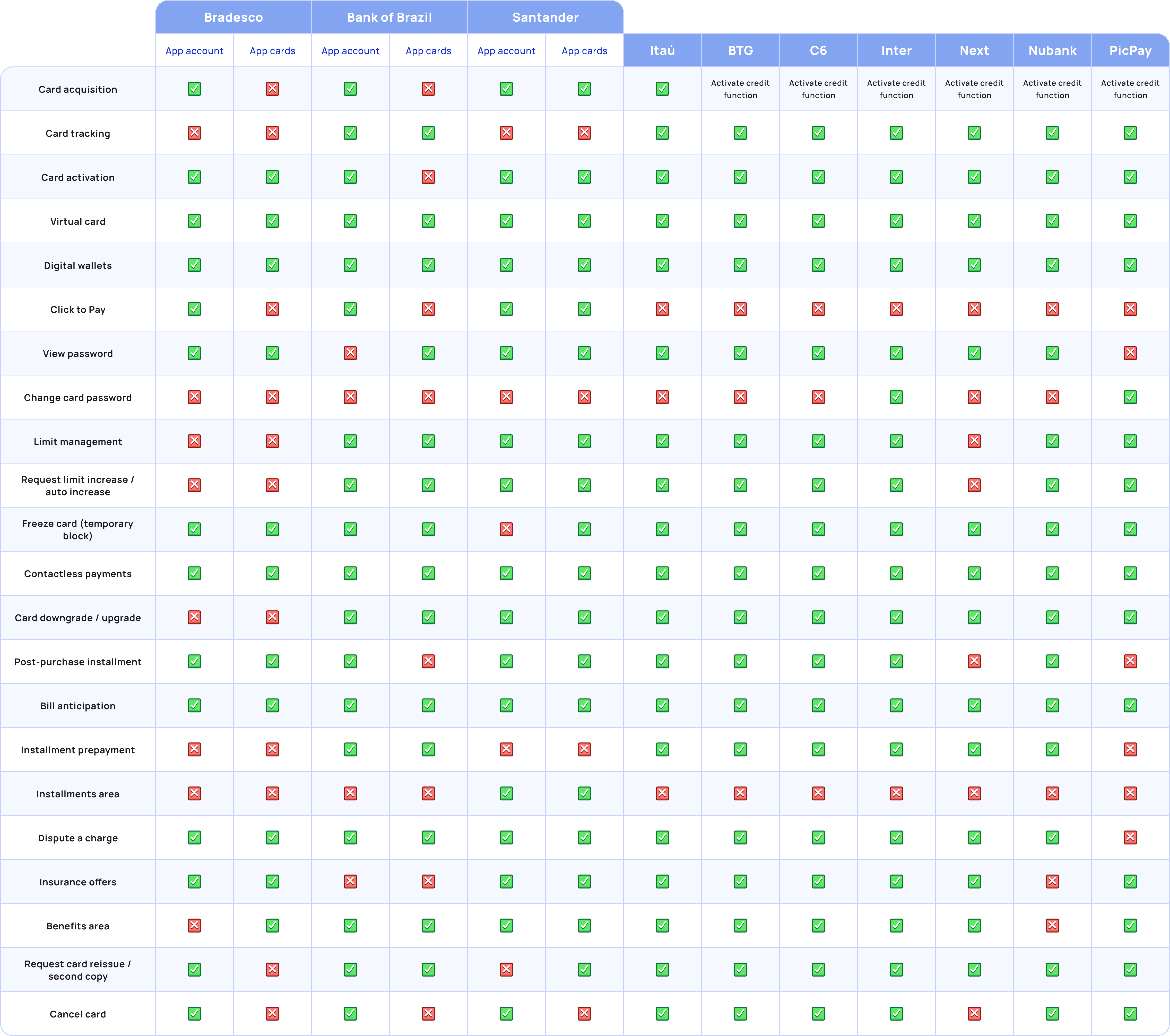
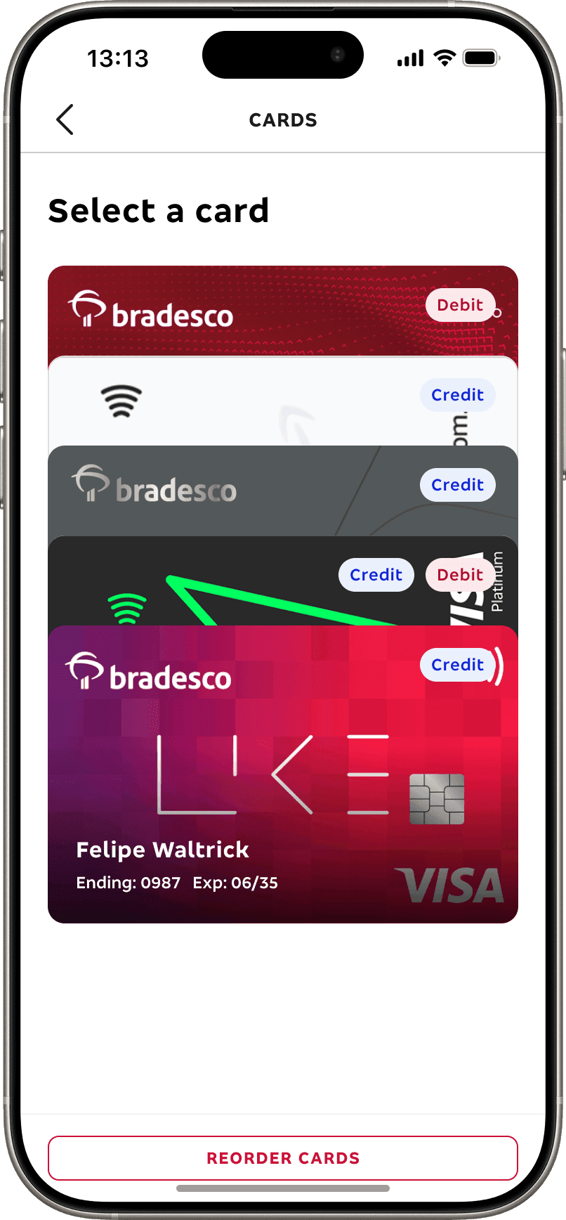
In current Bradesco apps, cards are displayed through a carousel… a pattern that works for 1–2 cards but easily breaks in a multi-card reality.
To understand how cards were displayed across Bradesco’s ecosystem, I conducted an internal benchmarking study of the main apps — Bradesco app, Bradesco Cards, Bradesco Business Cards, and PDPJ. Except for Next, which always has only one card, all of them used a carousel layout to display cards.
Bradesco App
Bradesco Cards

PDPJ
Next Banking
Among all mapped issues, the carousel pattern stood out the most. While it worked reasonably well in apps with just two or three cards, I knew it wouldn't scale for Bradesco_Next due to several problems, such as:
Scalability issues
Navigating 5–6 cards requires too many swipes, increasing cognitive load.
Low discoverability
Cards are often hidden off-screen, leading to high miss-click and abandonment rates.
Accessibility concerns
Swipe-only interactions are harder for users with motor impairments.
Inconsistent behavior
Switching between cards becomes unpredictable as the number grows.
No clear hierarchy
All cards look “the same” in the carousel, making it harder to prioritize the most relevant one.
Performance limitations
All cards and their data load at once as soon as the user enters the card area, which can cause slowdowns due to multiple calls and heavy request.
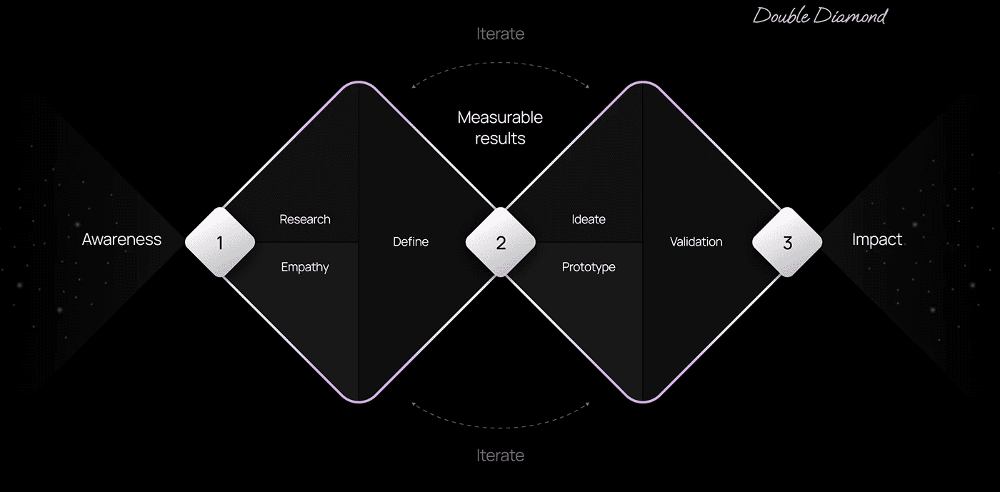
02 — DEFINE
Combining these insights allowed me to prioritize key actions and structure the experience — but I still needed to determine how to present multiple cards. That meant looking beyond our ecosystem into broader industry practices through benchmarking and desk researching.


It became the foundation for my design approach — the starting point for building the bradesco_next prototype and shaping how users would experience multiple cards for the very first time.
All the initial research led to one central hypothesis: a stack-based solution would deliver the most effective experience — reducing friction, improving usability, and ultimately proving that, while disruptive at first, it’s exactly what Bradesco’s ecosystem needs.
At this stage, my role shifted from research to experimentation — translating these insights into a working prototype and validating whether my design hypotheses would hold true with real users. Each decision was driven by assumptions built from research, user feedback, and data. Before any testing, I believed this approach could significantly improve overall experience.
01
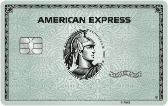
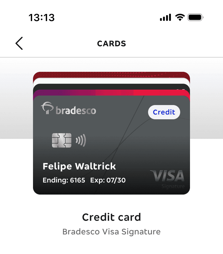
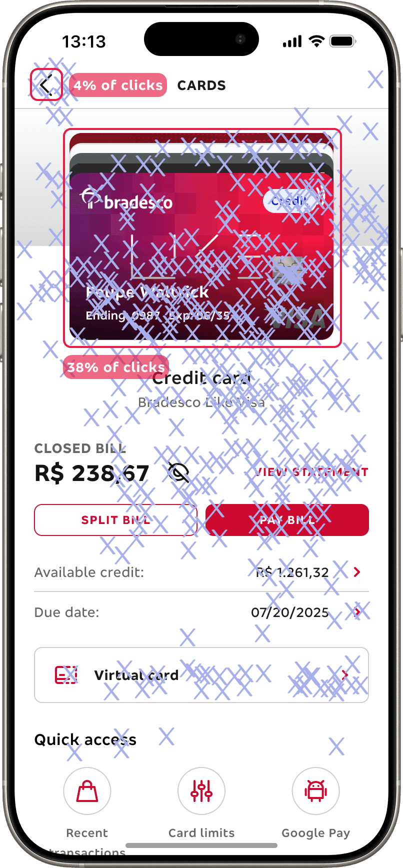
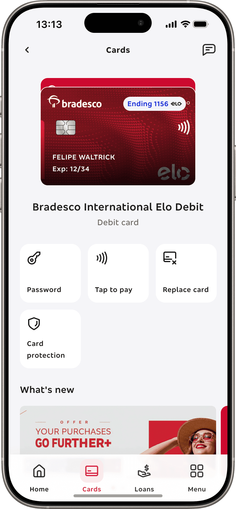
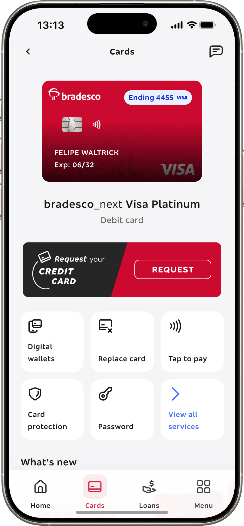
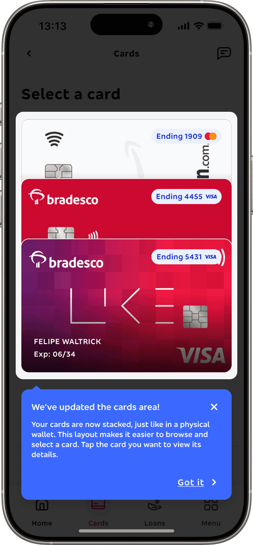
Card art
We created the card identification as real as posible, adding the tags Credit or Debit, the ending numbers and expiration date. Below the cards, there's the name of the product and it's category.
02
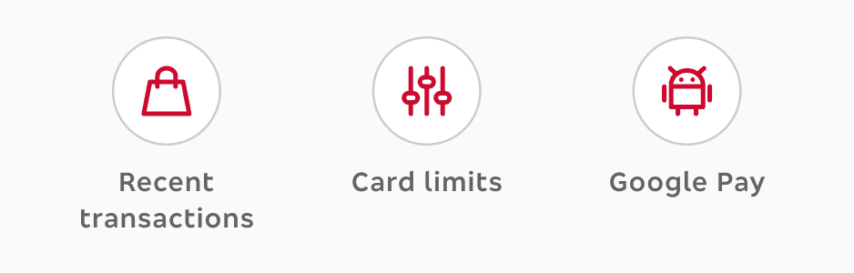
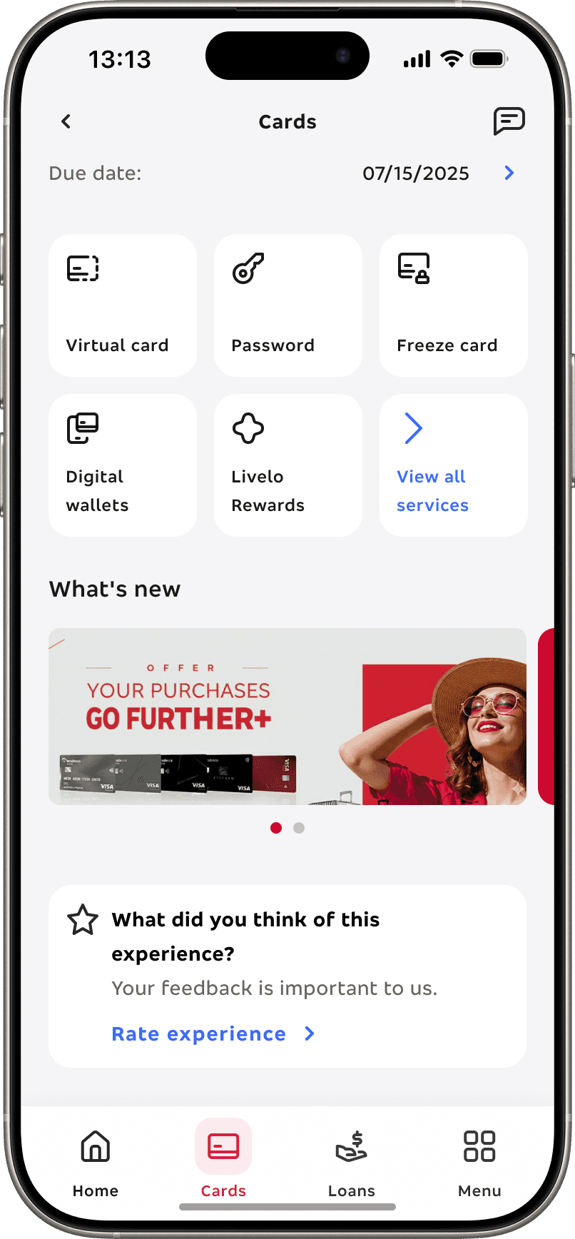
Top priorities
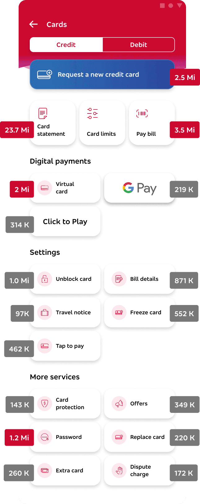
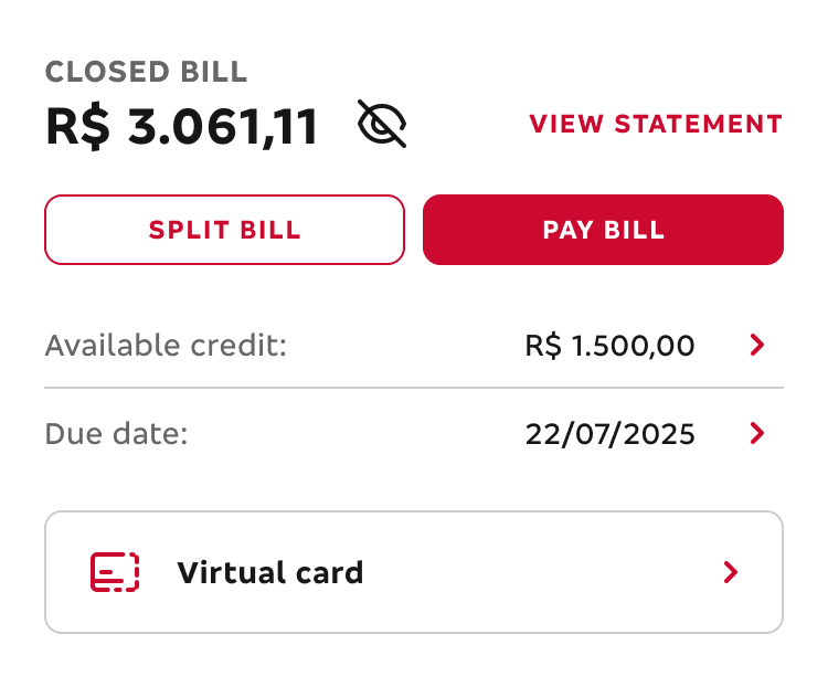
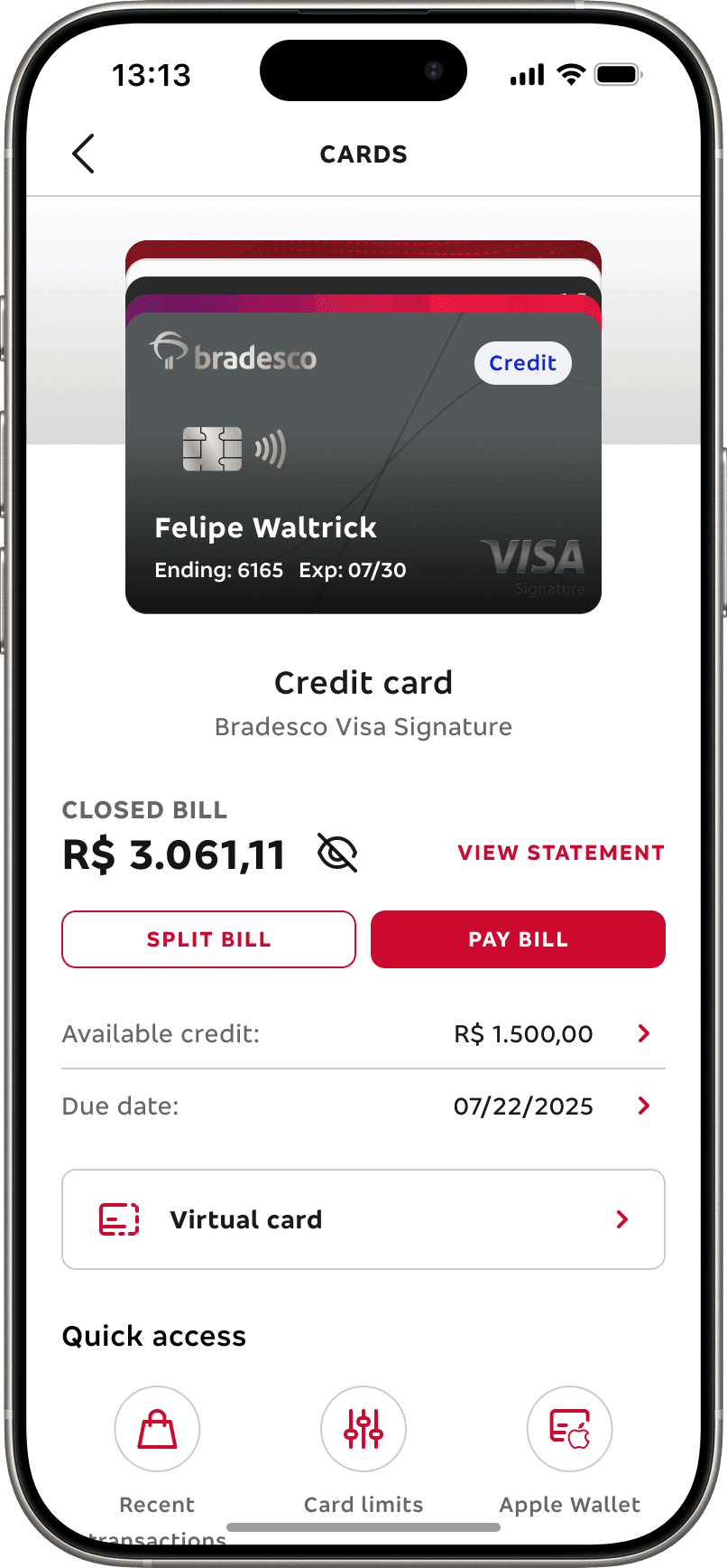
At the top, we prioritized the most critical tasks — such as viewing and paying the bill, checking limits, and monitoring due dates — alongside clear card identification and product details. These actions were placed here based on research insights and frequency of use, aiming to reduce friction and speed up daily routines.
03
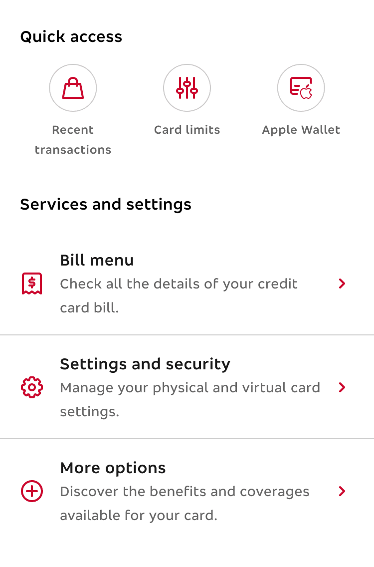
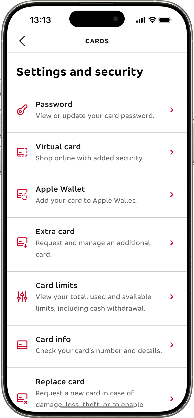
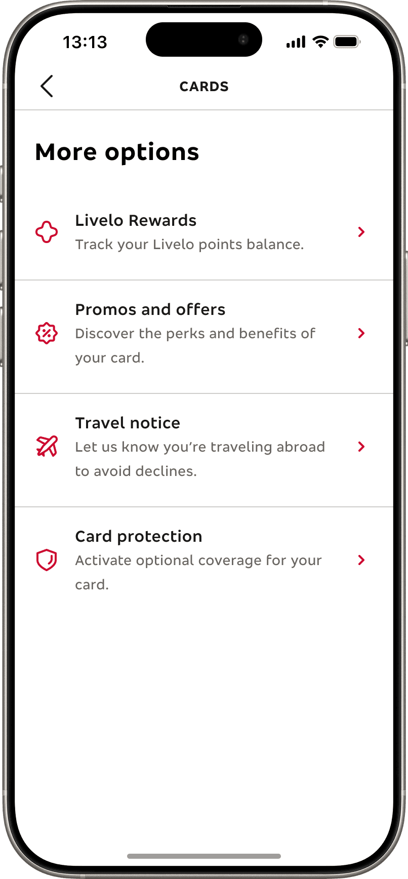
Quick access and new menu
In the center, users can access key features faster with a three-item quick-access area and a reorganized service hub split into Billing, Security & Settings, and More options. This structure was designed to simplify navigation and help users locate what they need without cognitive overload
04
Offers and engagement
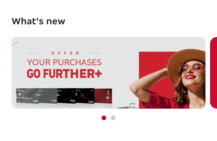
At the bottom, a dynamic carousel highlights promotions, product suggestions, and personalized offers. This section was created to test engagement opportunities and validate how CRM content can coexist with essential tasks without disrupting the primary flow.
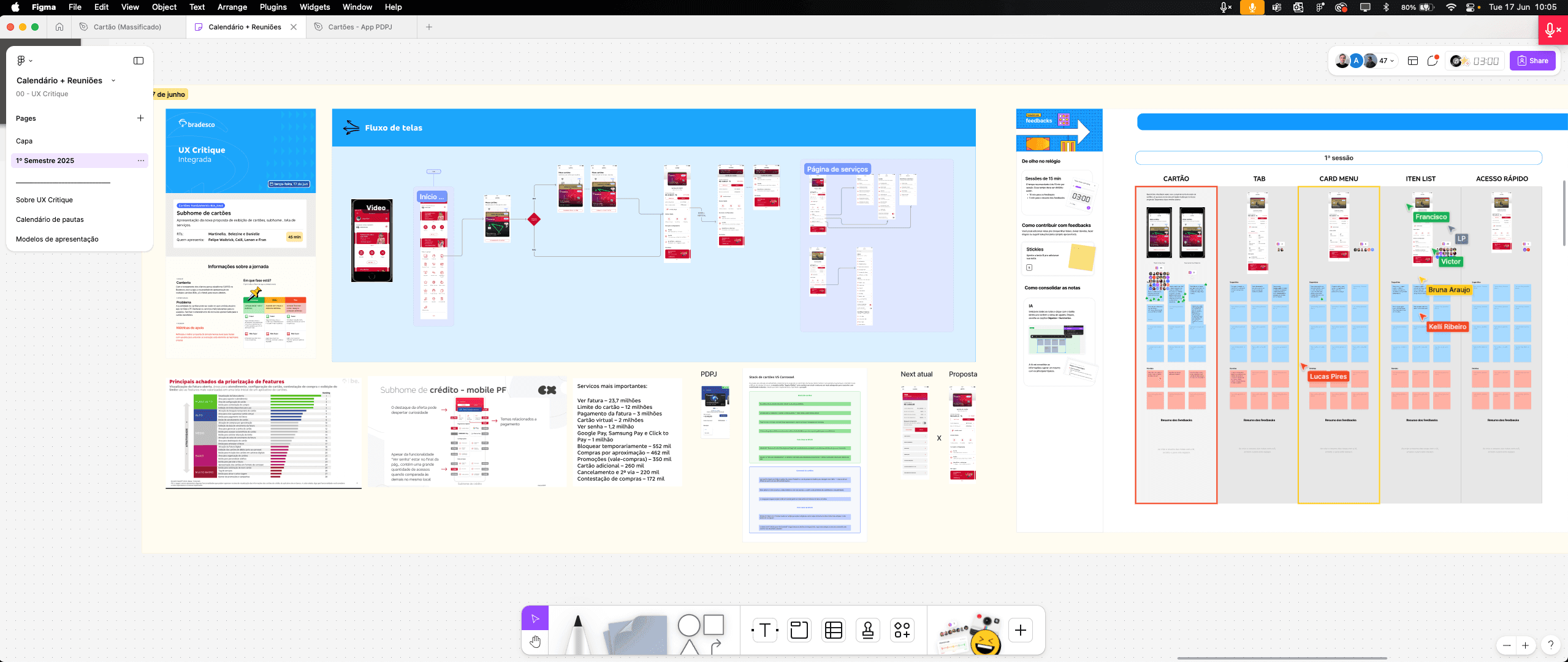
VS
Carousel VS Stack
04 — TEST
After building and refining our initial hypotheses, it was time to put everything to the test with real users
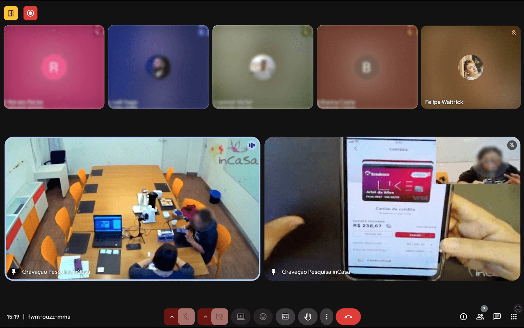
Qualitative research
Quantitative research
01
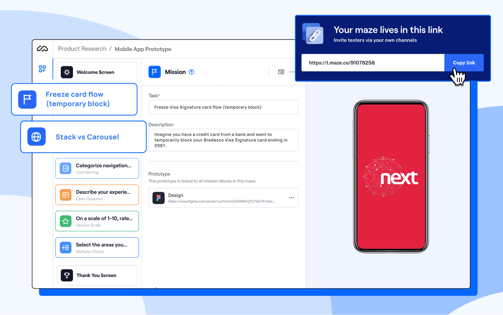
Setting up the test
A fully navigable prototype was built in Maze to simulate real user interactions inside the Bradesco Next experience
02
The task
Participants were asked to access the card area, select the Visa Signature card and perform a temporary block (Freeze card).
03
Results analysis
We analyzed Maze performance metrics, clicks, completion rates, and error patterns — to validate our initial hypotheses and uncover new usability opportunities.
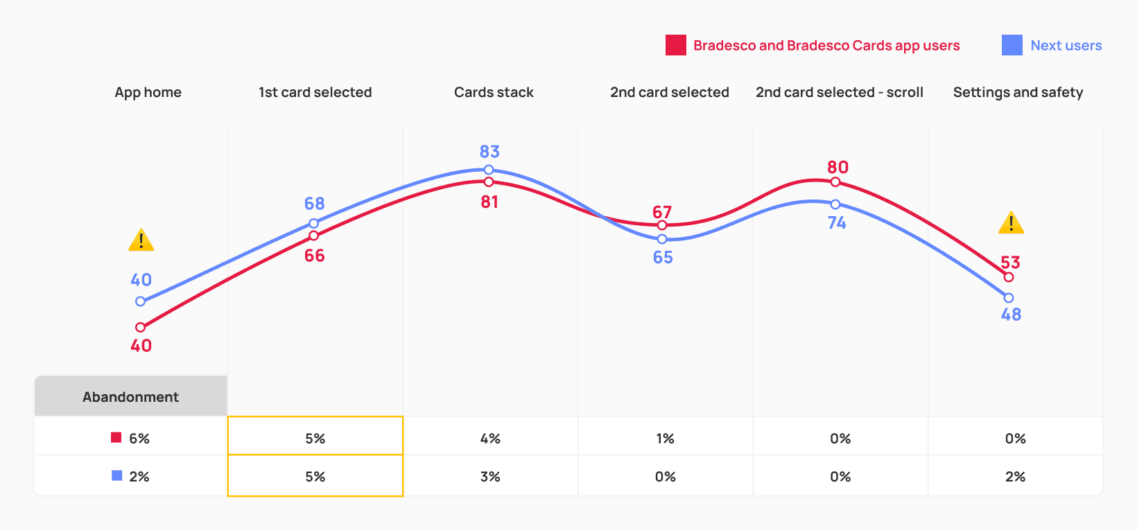
Usability score
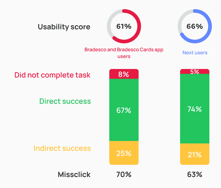
Both prototypes were affected by indirect task completion and misclick rates — but the carousel version showed significantly higher abandonment and error levels.
This suggests that users faced more friction and demonstrated lower tolerance when dealing with a larger number of cards in the carousel format.
STACK

CAROUSEL

SCREEN BY SCREEN - STACK
SCREEN BY SCREEN - CAROUSEL
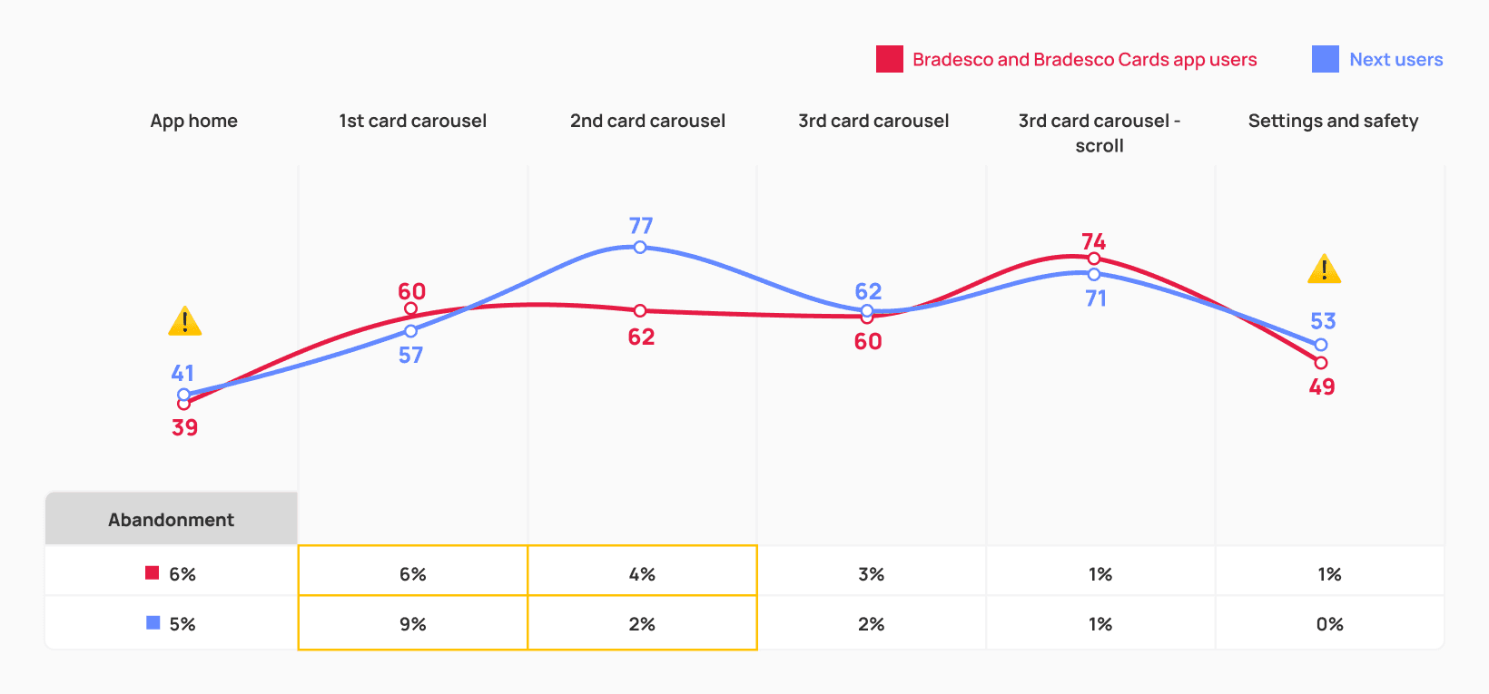
Both versions revealed the highest friction on the home and settings & security screens — indicating that the Cards feature is hard to locate and the settings menu remains confusing.
Accessibility tests also showed that while each format addresses different issues, the stack layout still needs refinement to better support users with visual limitations.
The stack design performed better for people with motor limitations, as it required less precision when interacting and reduced the effort needed for swipe gestures during navigation.

The carousel design was preferred by people with low vision, as it improved readability and matched patterns they were already familiar with in other banking apps.

The main action taken by participants when attempting to select the card for the temporary block was directly tapping on the stacked cards, showing that the interaction was largely understood.
This was also one of the screens with the highest abandonment rates (5%), suggesting that discoverability and guidance still need improvement to help users confidently access the full card stack.
Usability score
66
Missclick rate
58%
Abandonment rate
5%
Average click time
3s
I've never used this format before. I liked it, but did you notice how I kind of struggled interacting?
I believe that a horizontal layout would be more practical — just swiping to the side instead of clicking like this. But I guess I like it.
T.S., 45 years
Office Assistant, São Paulo/SP — participant with visual accessibility needs
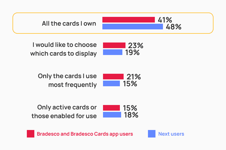
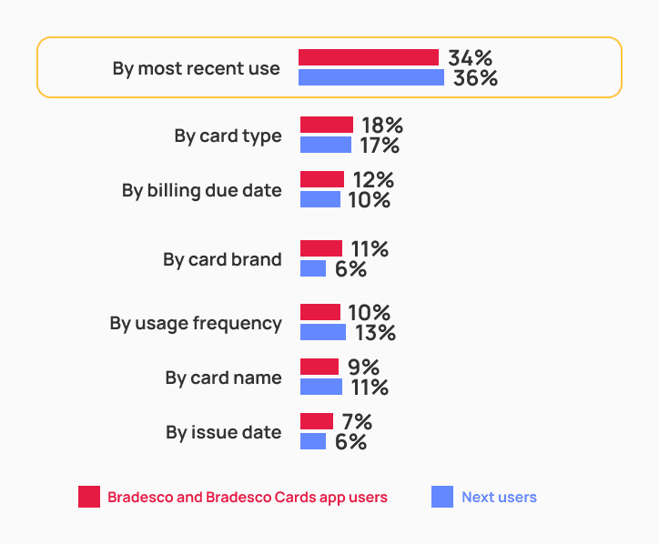
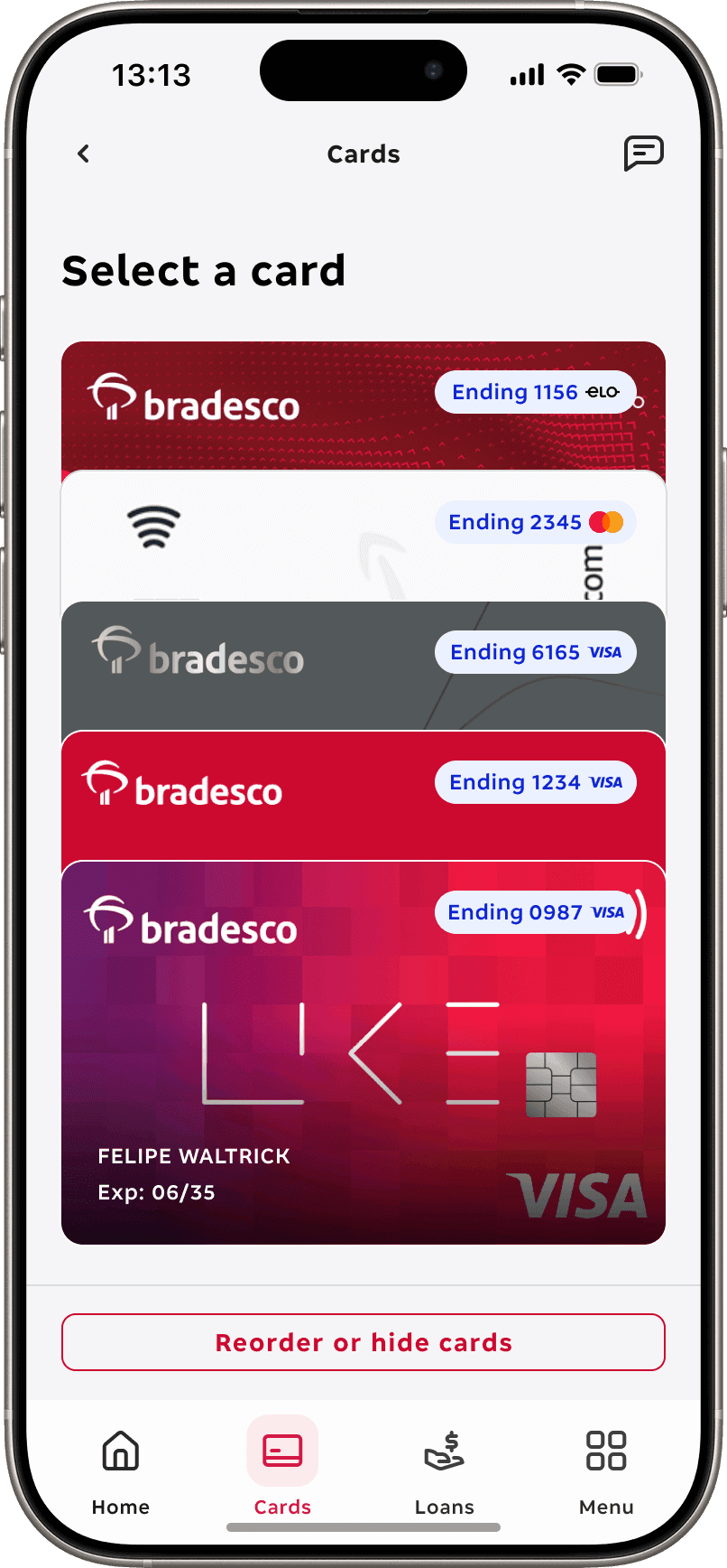
Card visibility and ordering preferences
Contrary to our initial assumption — that users would prefer the card with the highest spending to open automatically — testing revealed they actually expect the last accessed card to appear by default.
Most participants also expressed a desire to see all cards in the stack regardless of status or frequency of use, and to have them ordered by recent usage, starting with the most frequently used.
Which cards did you expect to find on this screen?
How would you like the cards to be organized on the screen?
Interpretation and clarity challenges
The “Sort Cards” button caused confusion: some users expected to manually reorder cards, while others didn’t understand its purpose — showing the need for clearer naming and communication.
Ease of use and card identification
When asked about the ease of switching between cards, more than half of participants described the process as simple and intuitive.
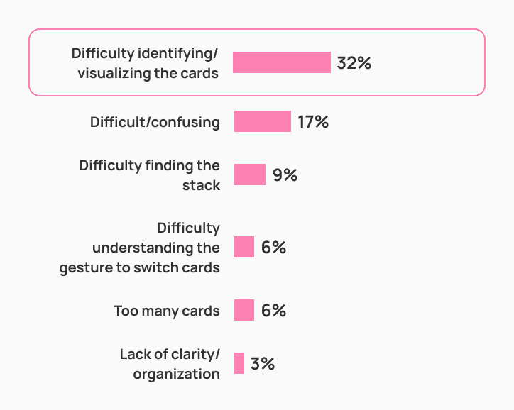
Those who struggled mentioned difficulty distinguishing one card from another — especially when visual cues were too subtle.
How would you rate the ease of switching between the cards you wanted to view — and, for those who found it difficult, what were the main reasons?
Very easy
Easy
Neutral
Difficult
Very difficult
Accessibility insights
Visual perception varies significantly. Most users without impairments easily noticed the credit, debit, or multi-function tags. But participants with low vision often couldn’t read them clearly or even mistook two similar-colored cards as one.
Based on these findings, we asked users how they preferred to identify their cards. Most of them indicated that the last four digits and the card network logo were far more meaningful than simply showing credit or debit. With these insights, we identified key areas for improvement in the next iteration
Add stronger visual contrast between cards (e.g., shadows, outlines, or extra spacing) to separate layers more clearly. Adjust the spacing dynamically based on the user’s device available height.
Instead of using credit, debit, or multicard tags, we could prioritize the last four digits and the card network logo as key identifiers, since research has shown that users rely on these infos the most.
Card sorting
To validate the new information architecture, we conducted a card sorting study. Users were presented with all available card-related services and asked to associate each one with one of the four proposed categories.
This helped us understand how users naturally group functionalities and identify misalignments between their mental models and the designed structure.
Categories naming
Participants grouped all items containing the term “bill” under the category “Bill Details.” Those related to security were placed under “Settings & Security.” More generic or unclear ones were assigned to “More Services.”
The “Settings” menu alone had fewer direct associations with specific features compared to “Security.” For that reason, highlighting “Security” in the label proved to be a more effective strategy for attracting user attention
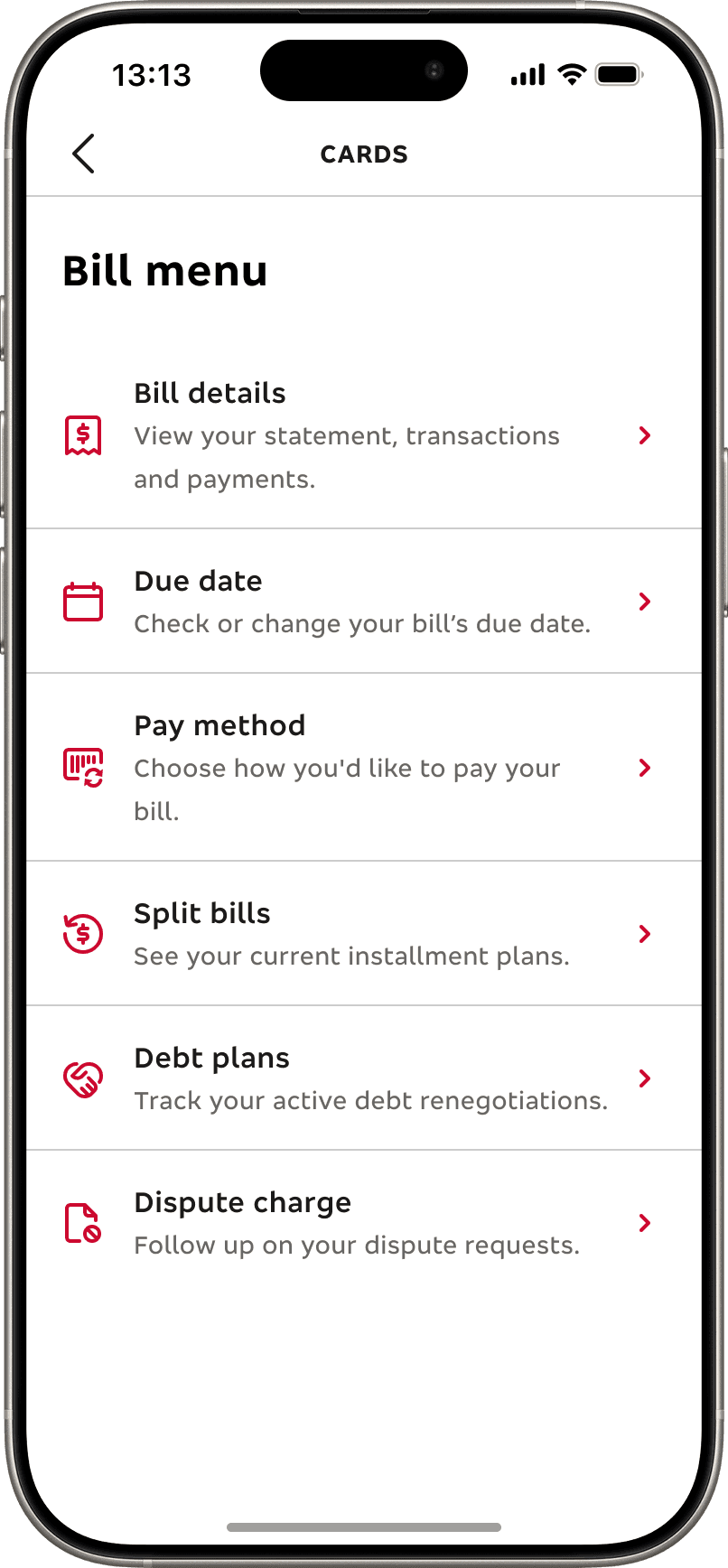
Bill details
Split bills
71%
Bill details
69%
Due date
53%
Debt plans
47%
*Pay method
35%
*Dispute charge
27%
*Replace card
27%
Security
Password
65%
Freeze card
62%
Card info
45%
Card protection
44%
*Tap to pay
35%
*Dispute charge
30%
Settings
Notifications
57%
*Pay method
30%
*Tap to pay
35%
*Card limits
32%
More services
Promos and offers
76%
Livelo Rewards
68%
Extra card
58%
Digital wallets
56%
Travel notice
50%
Virtual card
48%
*Card limits
32%
*Dispute charge
30%
*Replace card
29%
*Features like “pay method, dispute charge, replace card, limits and tap to pay were associated with more than one category — revealing a lack of clarity among users when defining where these actions should be grouped.
General perceptions
Visual elements were well received, but users requested greater emphasis and legibility for key information on the Cards screen. Details such as due date and card limit were seen as essential and should have stronger visual prominence.
User suggestions
• Increase text and icon sizes to improve readability — especially for users with low vision or aged 65+.
• Visually highlight recurring information such as available limit and bill due date.
Quick access
This section was positively rated by those who noticed it, but some users didn’t recognize the area, and certain features were misunderstood or went unnoticed.
Participants had difficulty locating the freeze card (temporary lock) feature within the “Settings & Safety” menu, resulting in a misclick rate above 80%.
The menu structure itself was positively evaluated, but users suggested reorganizing items, replacing shortcuts, and adding a search bar to make access more direct.
Usability score
53
Missclick rate
81%
Abandonment rate
0%
Average click time
19s
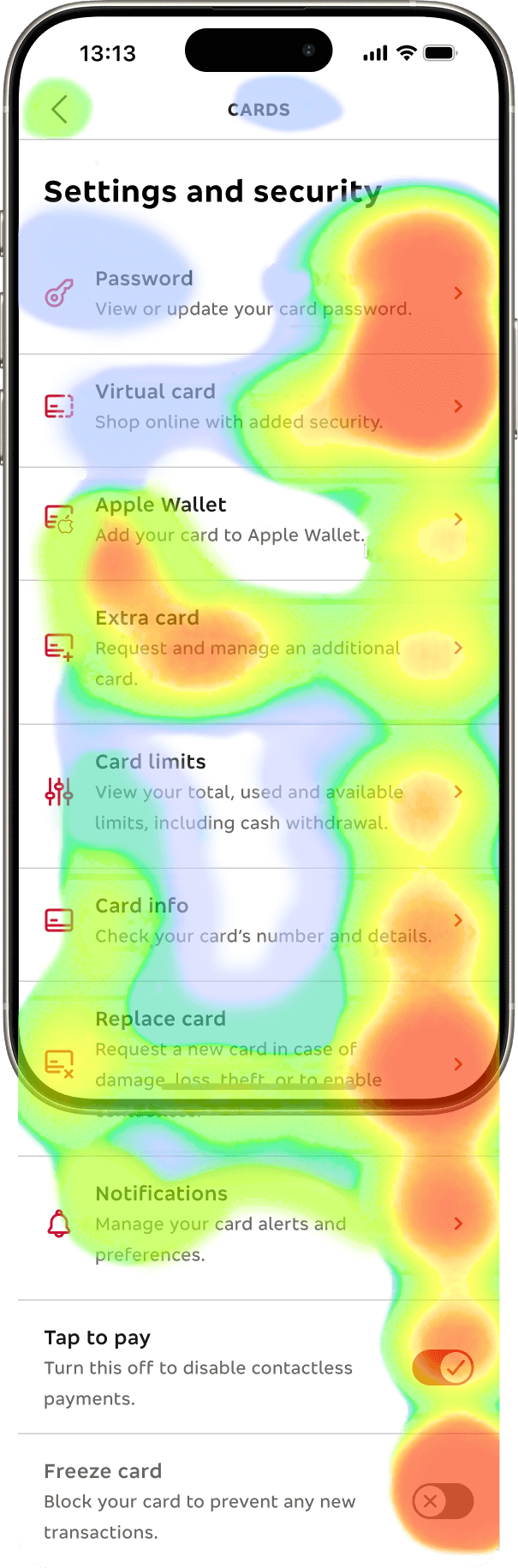
I mean… Usually, when you need to temporarily block a card, it’s an emergency — theft, loss… the more visible, the better.
D.S., 18 years
Sales Assistant — Salvador, BA. Bradescard user
05 — REFINE
During the refinement phase, our design system received a major update, unlocking a new visual language and component library that didn’t exist in the first prototype.
The new visual direction introduced cleaner surfaces, a light‑gray background replacing pure white, thicker borders, and blue CTAs that finally expanded the interaction palette beyond red‑only actions. The home screen also received a structural update, and a dedicated bottom navigation bar was added — giving “Cards” its own prominent entry point for the first time and fixing a key discoverability issue from the earlier version.
Home
Users couldn’t easily find the cards area to manage their cards.
Card stack
Visual and usability challenges with the stack format.
Selected card
Functional screen, but needs better hierarchy and flow.
Card menu organization
Intuitive structure, but needed refinement for better discoverability.
Before
After
Before
After
Before
After
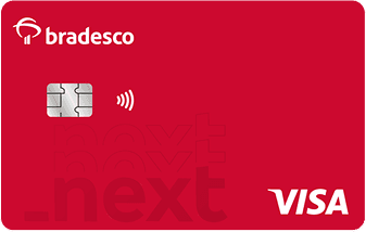
Bra_Next Credit/Debit
B2K
P2
Pure Debit
Bra_Next Debit
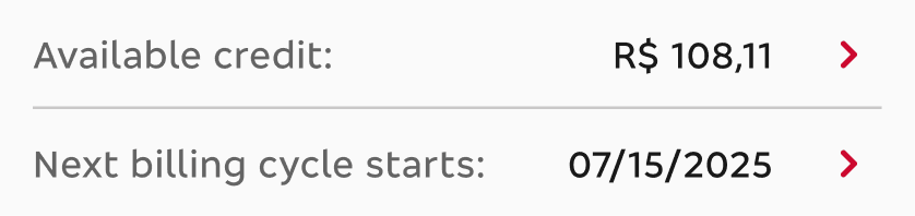
At this point, a standalone bradesco_next debit card was also added to the scope. It works similarly to the multi card, minus the credit-related features.
06 — RETEST
After refining the prototype we wanted to validate if the changes truly worked and effectively enhanced user usability, so we re-tested the product
Quantitative research
01
Setting up the test
A fully navigable prototype was built in Maze to simulate real user interactions inside the Bradesco_Next experience
02
The task
Participants were asked to access the card area, select the Visa Signature card and perform a temporary block (Freeze card) — the same task conducted during the first test.
03
Results analysis
We analyzed Maze performance metrics, clicks, completion rates, and error patterns — then compared them with the results from the first test.
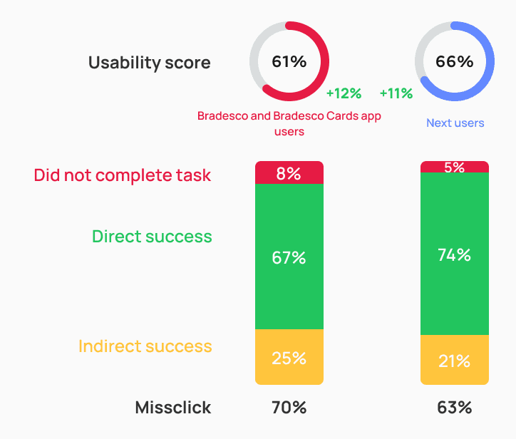
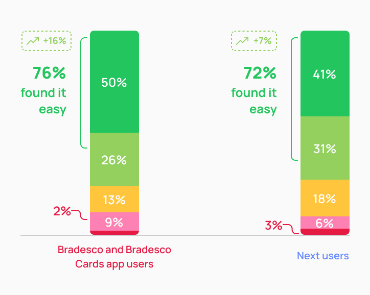
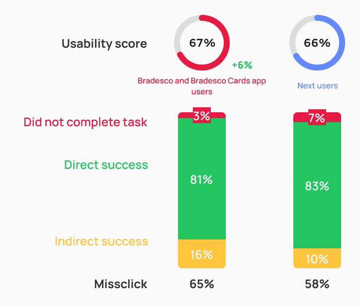
First impressions were very positive
The new version achieved an average increase of 10 points in usability score compared to the previous one. In addition, there was a higher direct success rate and a lower abandonment rate, showing that the implemented changes had a positive impact on overall performance.
FIRST VERSION
SECOND VERSION
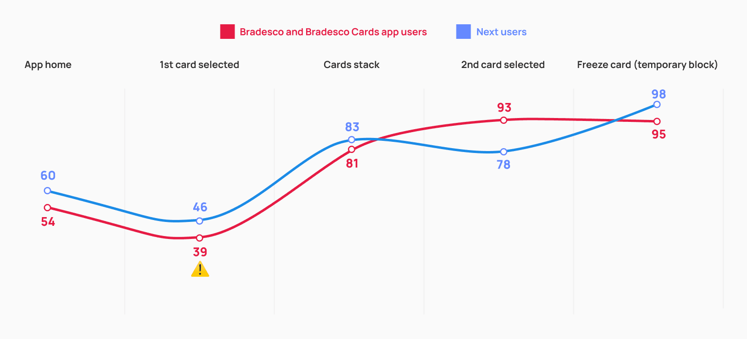
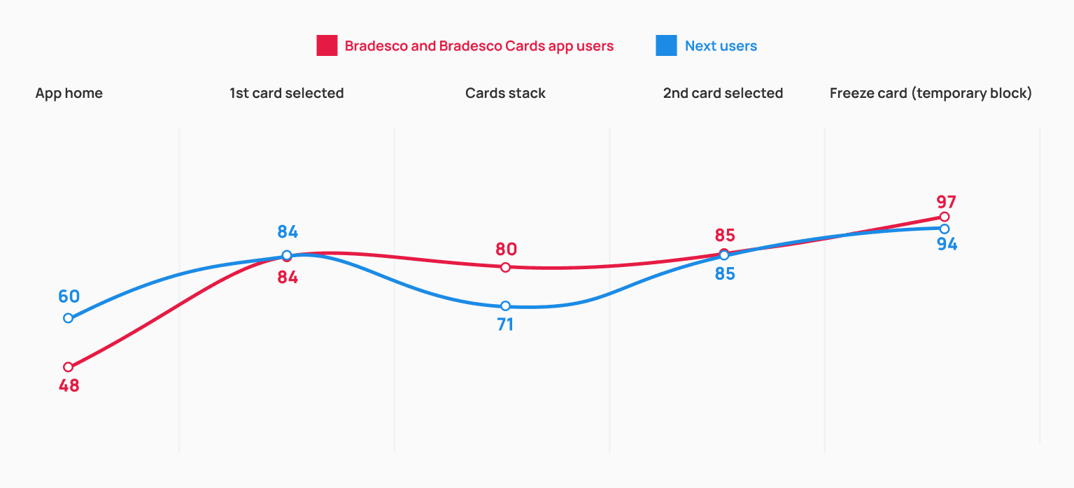
The screen where the first card opens automatically still causes some friction, but the rest of the journey feels intuitive and shows significant improvements compared to the first version.
The automatic opening of the first card lacked context for users to understand it as part of a stack.
SCREEN BY SCREEN
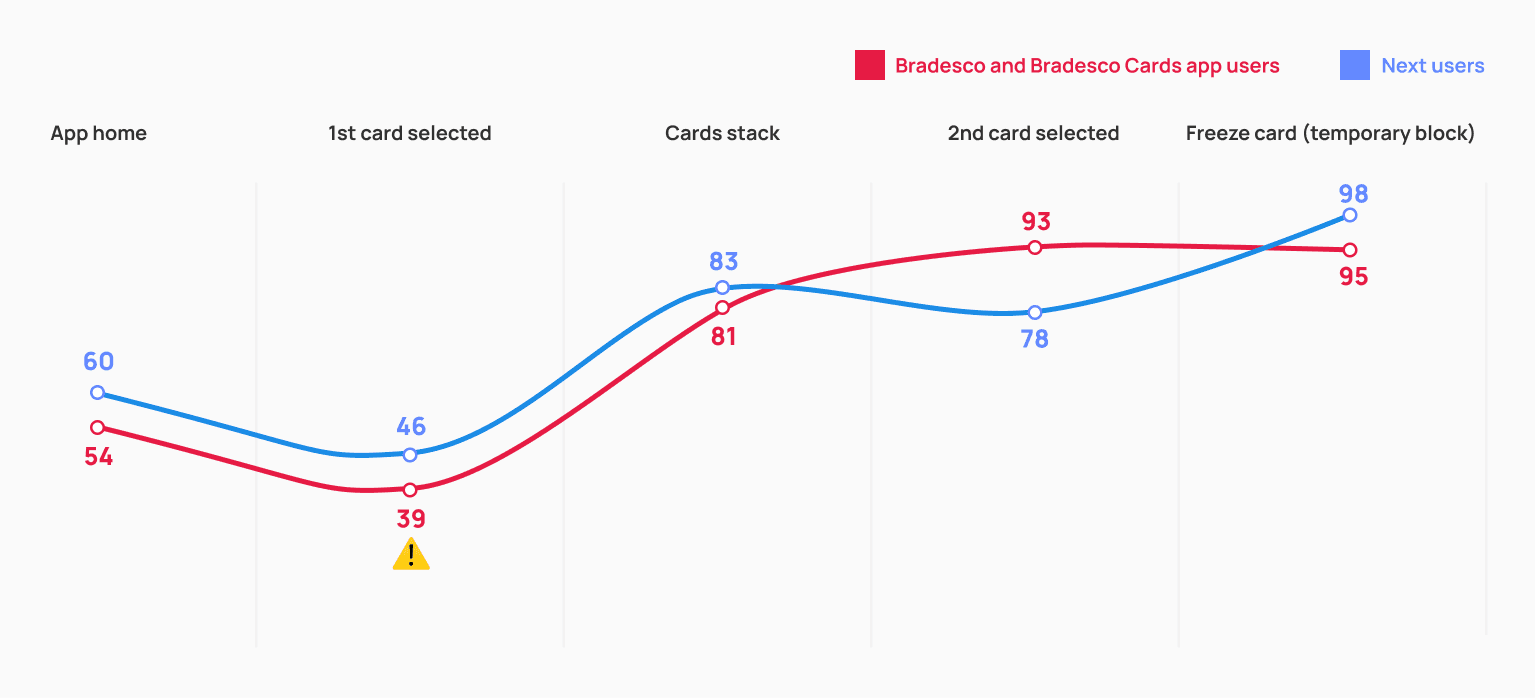
Learning curve
It’s still not fully intuitive for participants to understand that they need to tap the card to access the stack and switch between cards — reinforcing the need for a walkthrough on their first access to the card area.
As a result, the miss-click rate remained relatively high at this stage. Still, we managed to slightly reduce both the abandonment rate and the average click time among Next users compared to the first test.
BRADESCO AND BRADESCO CARDS APP USERS
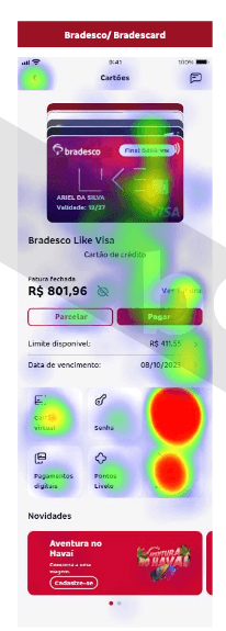
Usability score
39
Missclick
93%
Abandonment rate
4%
Average click time
32s
NEXT USERS
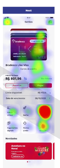
Usability score
46
Missclick
89%
Abandonment rate
2%
Average click time
22s
The location of the features is clear, but it wasn’t obvious that I needed to tap the card.
R.M., 27 years
Administrative Assistant — Belo Horizonte, MG. Next user
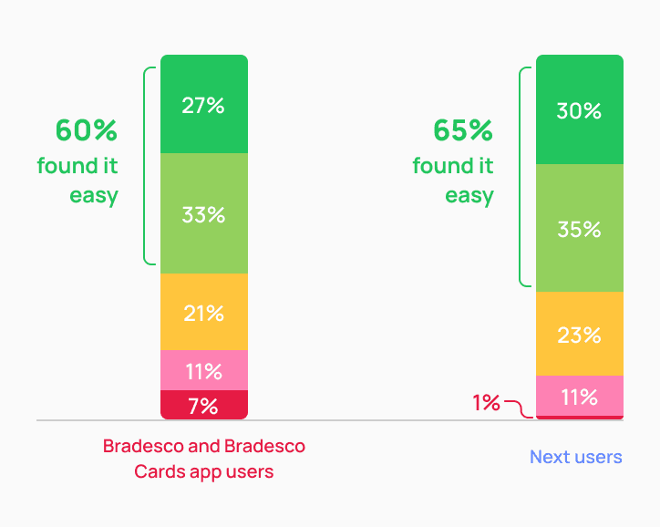
Ease of use and card identification
Adding the last four digits and the card brand logo directly to the card art significantly improved users’ ability to identify and switch between their cards.
This change proved to be more effective than using only “debit or credit” tags, as in the first test — making navigation smoother and reducing confusion when multiple cards were displayed.
Stack accessibility
Participants with low vision previously struggled to distinguish between similar-colored cards — often perceiving two stacked cards as a single one.
By introducing a white outline around each card, we increased visual contrast and made it easier for users with visual limitations to clearly identify individual cards within the stack.
How would you rate the ease of switching between cards?
Very easy
Easy
Neutral
Difficult
Very difficult
FIRST VERSION
SECOND VERSION
Card selected screen
Even with a cleaner layout and fewer elements on screen, the selected card screen received a more positive evaluation overall — showing a notable increase across all measured parameters.
This confirms that the new proposal performed better than the first version and achieved the expected results.
FIRST VERSION
SECOND VERSION
First-time onboarding test
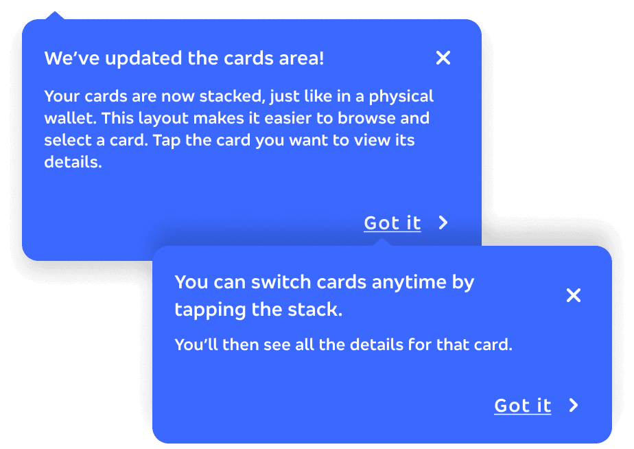
To validate the learning curve issue from the first test, we introduced a one-time onboarding flow — shown only once to users who had never interacted with the stack before, whether migrating from other Bradesco apps with multiple cards or just receiving a new one.
By comparing groups with and without onboarding, we confirmed it was effective, especially among Bradesco and Bradesco Cards users, who showed higher success rates and a better understanding of how to access and switch cards.
WITHOUT ONBOARDING
WITH ONBOARDING
It was very intuitive, and the messages that appeared guided me in the right direction.
B.T., 21 years
Student — Curitiba, PR. Next user
The screen where the first card opens automatically — previously one of the weakest points — showed a significant improvement after the introduction of the onboarding flow.
Users understood more clearly that the first visible card was part of a stack, which reduced friction and increased the usability score.
SCREEN BY SCREEN - WITHOUT ONBOARDING
SCREEN BY SCREEN - WITH ONBOARDING
With the guidance to tap the card to access the stack, there was a significant reduction in both the misclick rate and the average completion time.
WITHOUT ONBOARDING
Usability score
43
Missclick
91%
Abandonment rate
3%
Average click time
27s
WITH ONBOARDING
Usability score
84
Missclick
24%
Abandonment rate
1%
Average click time
1,9s
Ease of use and card identification
Displaying the cards stack as the first screen of the journey — along with the onboarding flow — made more participants consider it easy to switch between the cards they wanted to view.
This change proved to be more effective than using only “debit or credit” tags, as in the first test — making navigation smoother and reducing confusion when multiple cards were displayed.
How would you rate the ease of switching between cards?
Very easy
Easy
Neutral
Difficult
Very difficult
WITHOUT ONBOARDING
WITH ONBOARDING

Results from the second usability test confirmed that no structural changes were needed, allowing us to confidently move forward with the proposed solution.
Due to technical and operational constraints, the solution will be developed in phases. The final experience delivered in phase 2 reflects exactly what was validated through user testing.

Behavioral metrics
Task completion rate
Time to complete key actions
Card switch frequency
Abandonment rate
Feature discovery rate
Experience metrics
In-journey CSAT (0–5 stars after card activation)
Qualitative feedback from open text responses
The same experience and behavioral metrics defined for bradesco_next will also be collected in the Bradesco app.
Success benchmark examples
After 6 months in production, we’ll consider the journey successful if:
60%+ of ratings are 4 or 5 stars
Task completion remains above 75%
No critical friction points emerge from qualitative feedback
CTA rating button
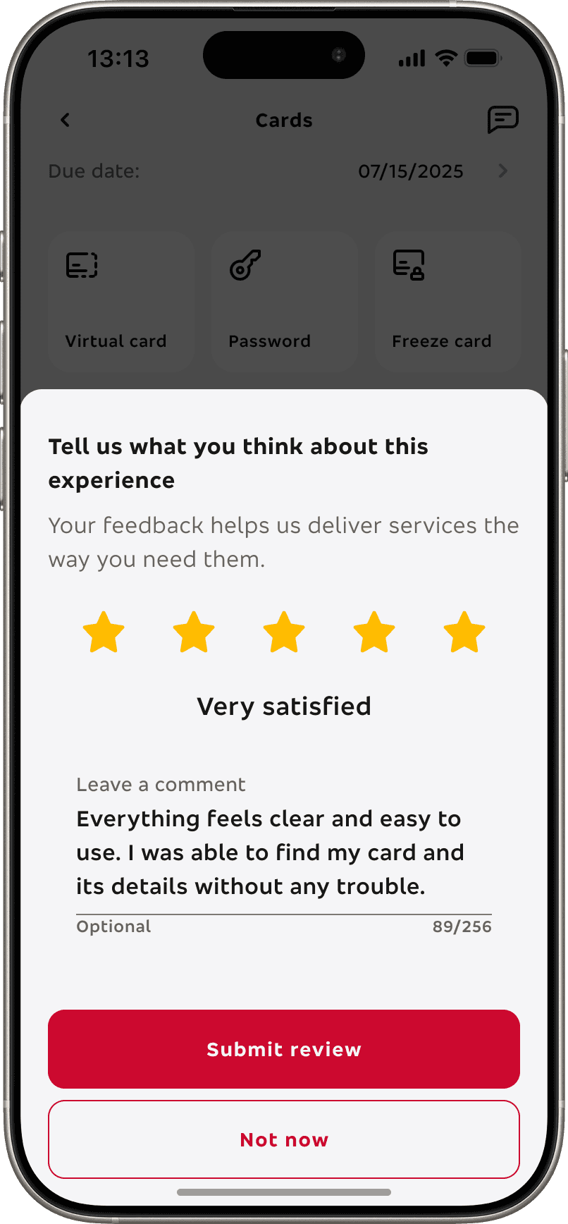
Rating template
Even with the product still not fully in production, I am extremely happy and confident that it reached its full potential, specially since it met all predefined success criteria (OKRs).
The stack layout outperformed the carousel, confirming it as the best interaction model.
The new card sub-home achieved 80%+ usability score with onboarding, exceeding our benchmark for excellence (70%).
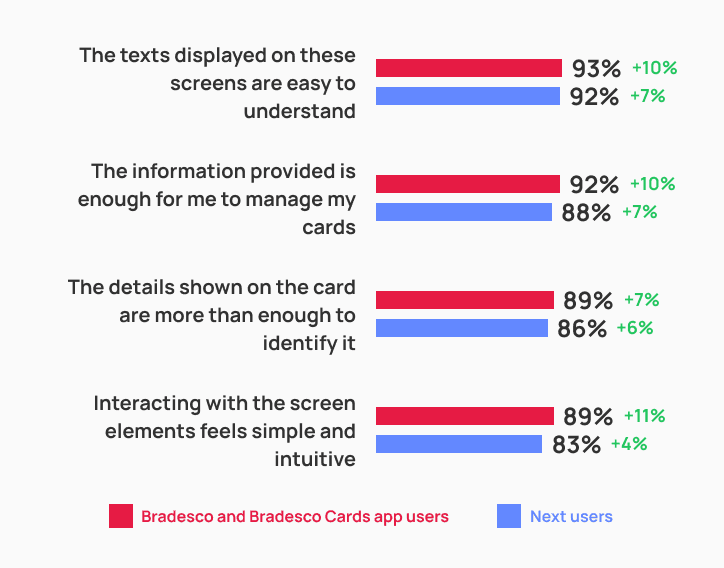
Users rated the final version with an average 74% ease-of-use score, indicating a clear and intuitive experience.
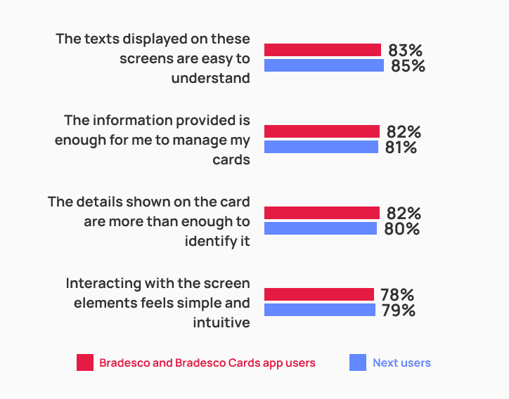
UI, copy, interactions, and information clarity scored between 80–90% approval, showing strong overall acceptance.
No critical usability issues were identified in the second test.


all done! thank you so much for reading this far, you are a true legend and I hope we can work together soon. Dm me ;)